
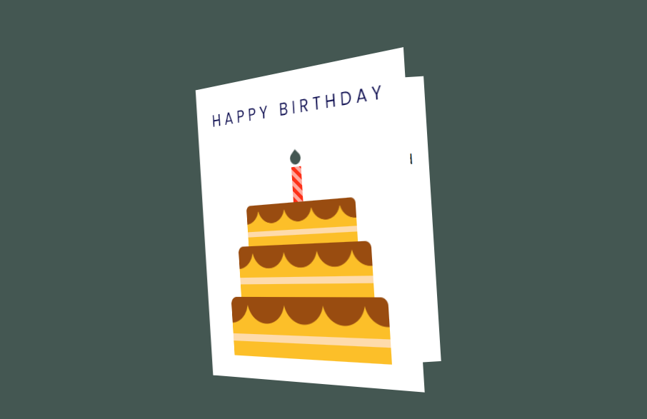
Today we Will Learn How To Make 3d Flip Birthday Card using Html and CSS
Introduction:
Creating a 3D Flip Birthday Card using HTML and CSS is an exciting project that demonstrates the power of modern web technologies. This interactive card brings a touch of magic to digital greetings, offering a unique and engaging user experience. Let’s explore the key components and techniques used in this creative web animation project.
HTML:
The HTML structure forms the foundation of our 3D card. It’s designed with a main container that houses two primary sections: the outside and the inside of the card. This clever arrangement allows for the creation of a realistic flip effect, mimicking the opening of a physical card. The outside features both a front and back side, while the inside contains a heartwarming message and a celebratory emoji.
<!DOCTYPE html>
<html lang="en">
  <head>
    <meta name="viewport" content="width=device-width, initial-scale=1.0" />
    <title>Birthday Card</title>
    <!-- Google Font-->
    <link
      href="https://fonts.googleapis.com/css2?family=Poppins&display=swap"
      rel="stylesheet"
    />
    <!-- Stylesheet -->
    <link rel="stylesheet" href="style.css" />
  </head>
  <body>
    <div class="card">
      <div class="outside">
        <div class="front">
          <p>Happy Birthday</p>
          <div class="cake">
            <div class="top-layer"></div>
            <div class="middle-layer"></div>
            <div class="bottom-layer"></div>
            <div class="candle"></div>
          </div>
        </div>
        <div class="back"></div>
      </div>
      <div class="inside">
        <p>Wishing you a very happy birthday filled with love and laughter</p>
        <h1>🎁</h1>
      </div>
    </div>
  </body>
</html>
CSS:
3D transformations are employed to create the flip effect. CSS properties such as perspective, transform-style, and backface-visibility work in concert to establish a realistic 3D space for the card animation.
The visual design is enhanced through the use of gradient backgrounds. Both linear and radial gradients are utilized to create visually interesting backgrounds, particularly noticeable in the cake layers and the inside of the card.
* {
  padding: 0;
  margin: 0;
  box-sizing: border-box;
  font-family: "Poppins", sans-serif;
}
body {
  background-color: #445752;
}
.card {
  width: 640px;
  height: 400px;
  position: absolute;
  margin: auto;
  left: 0;
  right: 0;
  top: 0;
  bottom: 0;
  -webkit-perspective: 1200px;
  perspective: 1200px;
  transition: 1s;
}
.card:hover {
  transform: rotate(-5deg);
}
.card:hover .outside {
  transform: rotateY(-130deg);
}
.outside,
.inside {
  height: 100%;
  width: 50%;
  position: absolute;
  left: 50.1%;
}
.inside {
  background: linear-gradient(to right, #e7e7e7, #ffffff 30%);
  line-height: 3;
  padding: 0 20px;
  text-align: center;
  display: flex;
  flex-direction: column;
  justify-content: space-around;
  align-items: center;
  left: 50%;
}
.outside {
  -webkit-transform-style: preserve-3d;
  transform-style: preserve-3d;
  z-index: 1;
  transform-origin: left;
  transition: 2s;
  cursor: pointer;
}
.front,
.back {
  height: 100%;
  width: 100%;
  position: absolute;
  -webkit-backface-visibility: hidden;
  backface-visibility: hidden;
  transform: rotateX(0deg);
}
.front {
  background-color: #ffffff;
}
.back {
  transform: rotateY(180deg);
  background: linear-gradient(to left, #e7e7e7, #ffffff 30%);
}
.cake {
  width: 100%;
  position: absolute;
  bottom: 30px;
}
.top-layer,
.middle-layer,
.bottom-layer {
  height: 80px;
  width: 240px;
  background-repeat: repeat;
  background-size: 60px 100px;
  background-position: 28px 0;
  background-image: linear-gradient(
      transparent 50px,
      #fedbab 50px,
      #fedbab 60px,
      transparent 60px
    ),
    radial-gradient(circle at 30px 5px, #994c10 30px, #fcbf29 31px);
  border-radius: 10px 10px 0 0;
  position: relative;
  margin: auto;
}
.middle-layer {
  transform: scale(0.85);
  top: 6px;
}
.top-layer {
  transform: scale(0.7);
  top: 26px;
}
.candle {
  height: 45px;
  width: 15px;
  background: repeating-linear-gradient(
    45deg,
    #fd3018 0,
    #fd3018 5px,
    #ffa89e 5px,
    #ffa89e 10px
  );
  position: absolute;
  margin: auto;
  left: 0;
  right: 0;
  bottom: 202px;
}
.candle:before {
  content: "";
  position: absolute;
  height: 16px;
  width: 16px;
  background-color: #445752;
  border-radius: 0 50% 50% 50%;
  bottom: 48px;
  transform: rotate(45deg);
  left: -1px;
}
.outside p {
  font-size: 23px;
  text-transform: uppercase;
  margin-top: 30px;
  text-align: center;
  letter-spacing: 6px;
  color: #000046;
}
.inside h1 {
  font-size: 120px;
  line-height: 120px;
}
If Your Project is Not Working or Has Any Problem Don’t Worry, Just Click on Below Download Assets File And You Will Be Able To Get Full Control Of Our Projects , Then Customize And Use it For Your Coding Journey. Let the coding adventure begin!
By Downloading this assets You Will Be Able to create an Glass Effect Navbar Using HTML & CSS Which Can Be Used For Several Projects i.e. A Flutter App Using Vs Code or For Android App Using Android Studio And Also For Custom Web Development.
Conclusion:
Creating a 3d Flip Birthday Card using Html and CSS has been an exciting project that showcases the power of modern web design techniques.