
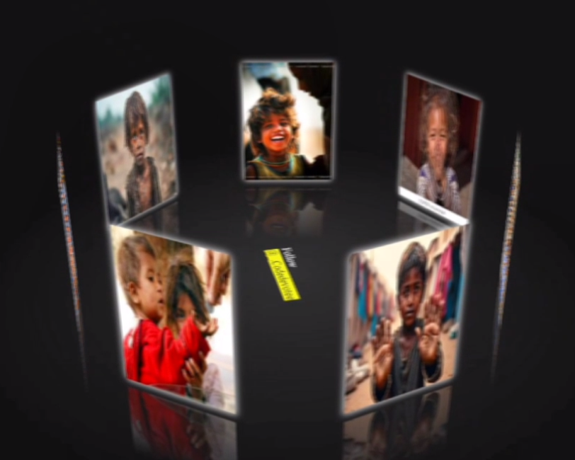
Today we Will Learn How To Make 3D Image Carousel using Html and CSS
Creating an engaging and interactive 3D Image Carousel can significantly enhance the visual appeal of your website. This project demonstrates how to build a stunning, rotating carousel using HTML, CSS, and JavaScript. Whether you’re a beginner or an experienced developer, this tutorial offers valuable insights into creating dynamic, eye-catching web elements.
HTML Overview:
The HTML forms the backbone of our carousel, creating a container for our rotating images. It’s structured with nested div elements that allow for 3D transformations. The outer container, with the id “drag-container”, serves as the stage for our carousel. Inside, we have a “spin-container” that holds our images and a decorative text element.
<!DOCTYPE html>
<html lang="en">

coding by mzdevcode

<head>
    <meta charset="UTF-8">
    <title>code devotee - 3D carousel</title>
    <link rel="stylesheet" href="style.css">
</head>

<body>
    <div id="drag-container">
        <div id="spin-container">
            <img src="beggar1.jpg" alt="">
            <img src="beggar2.jpeg" alt="">
            <img src="beggar3.jpeg" alt="">
            <img src="beggar4.jpeg" alt="">
            <img src="beggar5.jpeg" alt="">
            <img src="beggar6.jpeg" alt="">
            <img src="beggar7.jpeg" alt="">

            <p> Follow <mark>mzdevcode</mark></p>
        </div>
        <div id="ground"></div>
    </div>
    <div id="music-container"></div>
    <script src="./script.js"></script>
</body>
CSS:
The CSS is where the magic really happens, transforming our simple HTML structure into a visually stunning 3D carousel. Here’s how it works:
- The body is set to use 3D perspective, creating the illusion of depth.
- Our containers use
transform-style: preserve-3dto maintain the 3D effect for child elements. - Images are positioned absolutely and given a reflective effect using
box-reflect. - A ground element is created to enhance the 3D effect, using a radial gradient for a subtle shadow.
- Keyframe animations are defined for the spinning effect, allowing for both clockwise and counterclockwise rotations.
The CSS also includes responsive design elements and hover effects, making the carousel interactive and visually appealing on various devices.
* {
  margin: 0;
  padding: 0;
}

html,
body {
  height: 100%;
  /* for touch screen */
  touch-action: none;
}

body {
  overflow: hidden;
  display: -webkit-box;
  display: -ms-flexbox;
  display: flex;
  background: #111;
  -webkit-perspective: 1000px;
          perspective: 1000px;
  -webkit-transform-style: preserve-3d;
          transform-style: preserve-3d;
}

#drag-container, #spin-container {
  position: relative;
  display: -webkit-box;
  display: -ms-flexbox;
  display: flex;
  margin: auto;
  -webkit-transform-style: preserve-3d;
          transform-style: preserve-3d;
  -webkit-transform: rotateX(-10deg);
          transform: rotateX(-10deg);
}

#drag-container img, #drag-container video {
  -webkit-transform-style: preserve-3d;
          transform-style: preserve-3d;
  position: absolute;
  left: 0;
  top: 0;
  width: 100%;
  height: 100%;
  line-height: 200px;
  font-size: 50px;
  text-align: center;
  -webkit-box-shadow: 0 0 8px #fff;
          box-shadow: 0 0 8px #fff;
  -webkit-box-reflect: below 10px linear-gradient(transparent, transparent, #0005);
}

#drag-container img:hover, #drag-container video:hover {
  -webkit-box-shadow: 0 0 15px #fffd;
          box-shadow: 0 0 15px #fffd;
  -webkit-box-reflect: below 10px linear-gradient(transparent, transparent, #0007);
}

#drag-container p {
  font-family: Serif;
  position: absolute;
  top: 100%;
  left: 50%;
  -webkit-transform: translate(-50%,-50%) rotateX(90deg);
          transform: translate(-50%,-50%) rotateX(90deg);
  color: #fff;
}

#ground {
  width: 900px;
  height: 900px;
  position: absolute;
  top: 100%;
  left: 50%;
  -webkit-transform: translate(-50%,-50%) rotateX(90deg);
          transform: translate(-50%,-50%) rotateX(90deg);
  background: -webkit-radial-gradient(center center, farthest-side , #9993, transparent);
}

#music-container {
  position: absolute;
  top: 0;
  left: 0;
}

@-webkit-keyframes spin {
  from{
    -webkit-transform: rotateY(0deg);
            transform: rotateY(0deg);
  } to{
    -webkit-transform: rotateY(360deg);
            transform: rotateY(360deg);
  }
}

@keyframes spin {
  from{
    -webkit-transform: rotateY(0deg);
            transform: rotateY(0deg);
  } to{
    -webkit-transform: rotateY(360deg);
            transform: rotateY(360deg);
  }
}

@-webkit-keyframes spinRevert {
  from{
    -webkit-transform: rotateY(360deg);
            transform: rotateY(360deg);
  } to{
    -webkit-transform: rotateY(0deg);
            transform: rotateY(0deg);
  }
}

@keyframes spinRevert {
  from{
    -webkit-transform: rotateY(360deg);
            transform: rotateY(360deg);
  } to{
    -webkit-transform: rotateY(0deg);
            transform: rotateY(0deg);
  }
}

.github-corner:hover .octo-arm {
    animation: octocat-wave 560ms ease-in-out
}

@keyframes octocat-wave {

    0%,
    100% {
        transform: rotate(0)
    }

    20%,
    60% {
        transform: rotate(-25deg)
    }

    40%,
    80% {
        transform: rotate(10deg)
    }
}

@media (max-width:500px) {
    .github-corner:hover .octo-arm {
        animation: none
    }

    .github-corner .octo-arm {
        animation: octocat-wave 560ms ease-in-out
    }
}
JS:
var radius = 240; // how big of the radius
var autoRotate = true; // auto rotate or not
var rotateSpeed = -60; // unit: seconds/360 degrees
var imgWidth = 120; // width of images (unit: px)
var imgHeight = 170; // height of images (unit: px)

// Link of background music - set 'null' if you dont want to play background music
var bgMusicURL = 'https://api.soundcloud.com/tracks/143041228/stream?client_id=587aa2d384f7333a886010d5f52f302a';
var bgMusicControls = true; // Show UI music control


// ===================== start =======================
// animation start after 1000 miliseconds
setTimeout(init, 1000);

var odrag = document.getElementById('drag-container');
var ospin = document.getElementById('spin-container');
var aImg = ospin.getElementsByTagName('img');
var aVid = ospin.getElementsByTagName('video');
var aEle = [...aImg, ...aVid]; // combine 2 arrays

// Size of images
ospin.style.width = imgWidth + "px";
ospin.style.height = imgHeight + "px";

// Size of ground - depend on radius
var ground = document.getElementById('ground');
ground.style.width = radius * 3 + "px";
ground.style.height = radius * 3 + "px";

function init(delayTime) {
  for (var i = 0; i < aEle.length; i++) {
    aEle[i].style.transform = "rotateY(" + (i * (360 / aEle.length)) + "deg) translateZ(" + radius + "px)";
    aEle[i].style.transition = "transform 1s";
    aEle[i].style.transitionDelay = delayTime || (aEle.length - i) / 4 + "s";
  }
}

function applyTranform(obj) {
  // Constrain the angle of camera (between 0 and 180)
  if(tY > 180) tY = 180;
  if(tY < 0) tY = 0;

  // Apply the angle
  obj.style.transform = "rotateX(" + (-tY) + "deg) rotateY(" + (tX) + "deg)";
}

function playSpin(yes) {
  ospin.style.animationPlayState = (yes?'running':'paused');
}

var sX, sY, nX, nY, desX = 0,
    desY = 0,
    tX = 0,
    tY = 10;

// auto spin
if (autoRotate) {
  var animationName = (rotateSpeed > 0 ? 'spin' : 'spinRevert');
  ospin.style.animation = `${animationName} ${Math.abs(rotateSpeed)}s infinite linear`;
}

// add background music
if (bgMusicURL) {
  document.getElementById('music-container').innerHTML += `
<audio src="${bgMusicURL}" ${bgMusicControls? 'controls': ''} autoplay loop>
<p>If you are reading this, it is because your browser does not support the audio element.</p>
</audio>
`;
}

// setup events
document.onpointerdown = function (e) {
  clearInterval(odrag.timer);
  e = e || window.event;
  var sX = e.clientX,
      sY = e.clientY;

  this.onpointermove = function (e) {
    e = e || window.event;
    var nX = e.clientX,
        nY = e.clientY;
    desX = nX - sX;
    desY = nY - sY;
    tX += desX * 0.1;
    tY += desY * 0.1;
    applyTranform(odrag);
    sX = nX;
    sY = nY;
  };

  this.onpointerup = function (e) {
    odrag.timer = setInterval(function () {
      desX *= 0.95;
      desY *= 0.95;
      tX += desX * 0.1;
      tY += desY * 0.1;
      applyTranform(odrag);
      playSpin(false);
      if (Math.abs(desX) < 0.5 && Math.abs(desY) < 0.5) {
        clearInterval(odrag.timer);
        playSpin(true);
      }
    }, 17);
    this.onpointermove = this.onpointerup = null;
  };

  return false;
};

document.onmousewheel = function(e) {
  e = e || window.event;
  var d = e.wheelDelta / 20 || -e.detail;
  radius += d;
  init(1);
};
Remember, the key to mastering these techniques is practice and experimentation. Feel free to adjust the blur intensity, change the background image, or add your own creative touches to make this navbar uniquely yours!
If Your Project is Not Working or Has Any Problem Don’t Worry, Just Click on Below Download Assets File And You Will Be Able To Get Full Control Of Our Projects , Then Customize And Use it For Your Coding Journey. Let the coding adventure begin!
By Downloading this assets You Will Be Able to create an Glass Effect Navbar Using HTML & CSS Which Can Be Used For Several Projects i.e. A Flutter App Using Vs Code or For Android App Using Android Studio And Also For Custom Web Development.
Conclusion:
Creating a 3D Image Carousel using Html and CSS has been an exciting project that showcases the power of modern web design techniques.