
Creating a Stylish Hover Button with CSS
In today’s coding session, we’re going to create a modern hover button using HTML and CSS. This tutorial will guide you through crafting a stylish button that features an engaging hover effect, perfect for enhancing your web projects. Whether you’re a seasoned developer or just starting out, this project is a fun way to add some flair to your designs. Let’s dive into the code!
HTML Structure
The HTML code for our button is straightforward yet effective. It consists of a container that holds the button and a heading that prompts users to interact with it. Here’s the code:
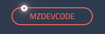
<div class="container">
<div class="btn">
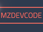
<span>mzdevcode</span>
<div class="dot"></div>
</div>
<h1>☝ Hover on the button ☝</h1>
</div>CSS Styling
To bring our button to life, we’ll apply some sleek CSS styles. The styles include custom properties for colors and dimensions, along with animations that create an eye-catching hover effect. Below is the complete CSS code:
:root {
    --bg: #2E3B4E; /* Darker background color */
    --primary: #FF6F61; /* New primary color */
    --solid: #FFFFFF; /* Solid color remains white */
    --btn-w: 10em;
    --dot-w: calc(var(--btn-w) * 0.2);
    --tr-X: calc(var(--btn-w) - var(--dot-w));
}

* {
    box-sizing: border-box;
}

*:before, *:after {
    box-sizing: border-box;
}

body {
    height: 100vh;
    display: flex;
    justify-content: center;
    align-items: center;
    flex-flow: wrap;
    background: var(--bg);
    font-size: 20px;
    font-family: 'Titillium Web', sans-serif;
}

h1 {
    color: var(--solid);
    font-size: 2.5rem;
    margin-top: 6rem;
}

.btn {
    position: relative;
    margin: 0 auto;
    width: var(--btn-w);
    color: var(--primary);
    border: .15em solid var(--primary);
    border-radius: 5em;
    text-transform: uppercase;
    text-align: center;
    font-size: 1.3em;
    line-height: 2em;
    cursor: pointer;
}

.dot {
    content: '';
    position: absolute;
    top: 0;
    width: var(--dot-w);
    height: 100%;
    border-radius: 100%;
    transition: all 300ms ease;
    display: none;
}

.dot:after {
    content: '';
    position: absolute;
    left: calc(50% - .4em);
    top: -.4em;
    height: .8em;
    width: .8em;
    background: var(--primary);
    border-radius: 1em;
    border: .25em solid var(--solid);
    box-shadow: 0 0 .7em var(--solid), 0 0 2em var(--primary);
}

.btn:hover .dot,
.btn:focus .dot {
    animation: atom 2s infinite linear;
    display: block;
}

@keyframes atom {
   0% {transform: translateX(0) rotate(0);}
   30% {transform: translateX(var(--tr-X)) rotate(0);}
   50% {transform: translateX(var(--tr-X)) rotate(180deg);}
   80% {transform: translateX(0) rotate(180deg);}
   100% {transform: translateX(0) rotate(360deg);}
}
Explanation of the Code
- HTML Structure:
- The
containerdiv holds the button and the heading. - The
btndiv contains a span for the button text and adotdiv for the animated effect.
- The
- CSS Styling:
- We define several custom properties (CSS variables) for colors and dimensions to maintain consistency and ease of adjustments.
- Button Styles:
- The button is styled with rounded edges, a solid border, and uppercase text.
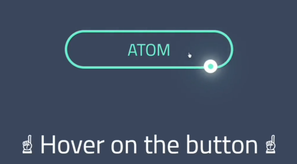
- Hover Effect:
- The
dotelement appears on hover, creating an animated effect that draws attention to the button.
- The
Conclusion
And there you have it! In just a few simple steps, we’ve created a stylish hover button using HTML and CSS, complete with an engaging animation. This design not only enhances user interaction but also adds a modern touch to your web projects. Whether you’re an experienced coder or just starting out, experimenting with these styles can lead to amazing results. Happy coding!