
Today, we’re taking on an exciting project: creating an interactive Panda-themed Login Form using HTML, CSS, and JavaScript.
Introduction
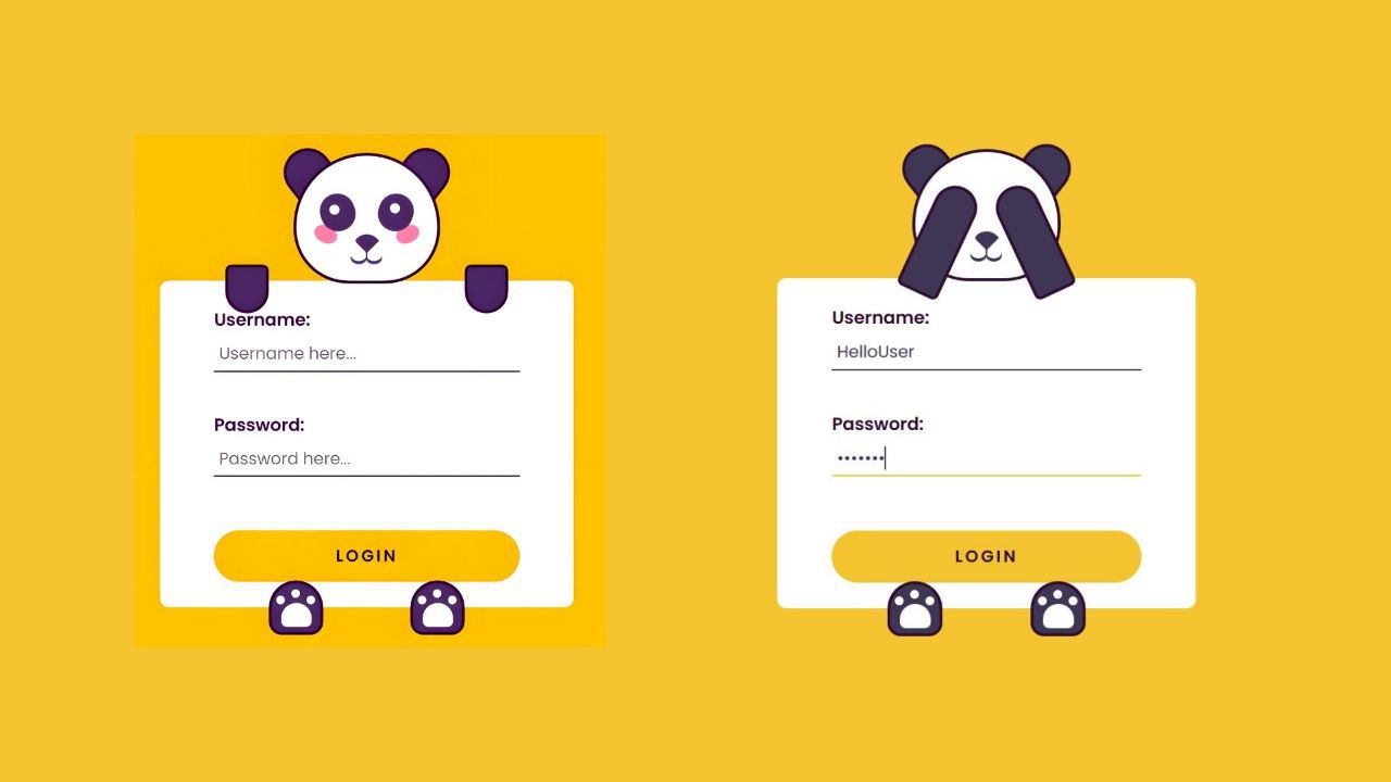
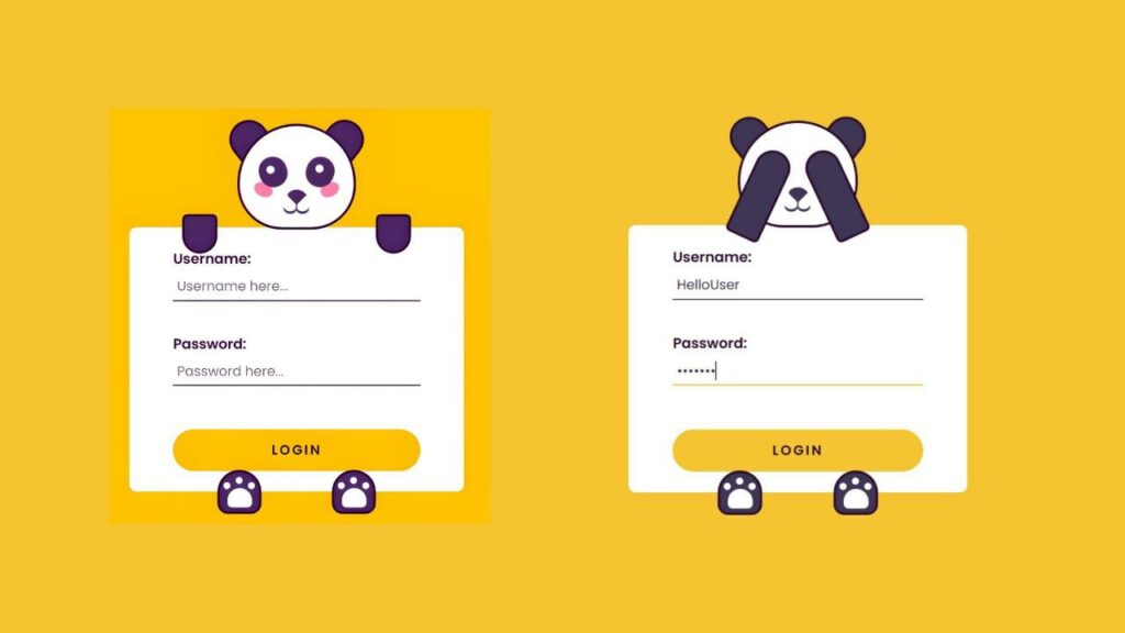
The Panda Login Form is a fun, interactive login interface designed to create a memorable user experience. It uses a playful panda face, which reacts dynamically when users interact with the input fields for username and password, making the login process engaging and unique.
Card Structure
The structure of the form is straightforward, consisting of:
- A main form containing the input fields (
UsernameandPassword). - A panda face with movable eyes, ears, and hands positioned around the form to create the visual appeal of a panda.
- Additional decorative elements, such as blush marks and paws, complete the panda’s look.
HTML :
<!DOCTYPE html>
<html lang="en">
  <head>
    <meta name="viewport" content="width=device-width, initial-scale=1.0" />
    <title>Panda Login Form</title>
    <!-- Google Font -->
    <link
      href="https://fonts.googleapis.com/css2?family=Poppins:wght@400;600&display=swap"
      rel="stylesheet"
    />
    <!-- Stylesheet -->
    <link rel="stylesheet" href="style.css" />
  </head>
  <body>
    <div class="container">
      <form>
        <label for="username">Username:</label>
        <input type="text" id="username" placeholder="Username here..." /><br>
        <label for="password">Password:</label>
        <input type="password" id="password" placeholder="Password here..." /><br>
        <button>Login</button>
      </form>
      <div class="ear-l"></div>
      <div class="ear-r"></div>
      <div class="panda-face">
        <div class="blush-l"></div>
        <div class="blush-r"></div>
        <div class="eye-l">
          <div class="eyeball-l"></div>
        </div>
        <div class="eye-r">
          <div class="eyeball-r"></div>
        </div>
        <div class="nose"></div>
        <div class="mouth"></div>
      </div>
      <div class="hand-l"></div>
      <div class="hand-r"></div>
      <div class="paw-l"></div>
      <div class="paw-r"></div>
    </div>
    <!-- Script -->
    <script src="script.js"></script>
  </body>
</html>
Animation Effects
The form comes to life with animations:
- Eye Movement: The panda’s eyes move towards the input field when the user focuses on the username.
- Hand Movement: When focusing on the password field, the panda’s hands move to cover its eyes, simulating a playful “peek-a-boo” effect.
- These animations are coded in JavaScript, using event listeners to detect when a user clicks on the input fields.
CSS
*{
  padding: 0;
  margin: 0;
  box-sizing: border-box;
  font-family: "Poppins", sans-serif;
}
body {
  background-color: #f4c531;
}
.container {
  height: 31.25em;
  width: 31.25em;
  position: absolute;
  transform: translate(-50%, -50%);
  top: 50%;
  left: 50%;
}
form {
  width: 23.75em;
  height: 18.75em;
  background-color: #ffffff;
  position: absolute;
  transform: translate(-50%, -50%);
  top: calc(50% + 3.1em);
  left: 50%;
  padding: 0 3.1em;
  display: flex;
  flex-direction: column;
  justify-content: center;
  border-radius: 0.5em;
}
form label {
  display: block;
  margin-bottom: 0.2em;
  font-weight: 600;
  color: #2e0d30;
}
form input {
  font-size: 0.95em;
  font-weight: 400;
  color: #3f3554;
  padding: 0.3em;
  border: none;
  border-bottom: 0.12em solid #3f3554;
  outline: none;
}
form input:focus {
  border-color: #f4c531;
}
form input:not(:last-child) {
  margin-bottom: 0.9em;
}
form button {
  font-size: 0.95em;
  padding: 0.8em 0;
  border-radius: 2em;
  border: none;
  cursor: pointer;
  outline: none;
  background-color: #f4c531;
  color: #2e0d30;
  text-transform: uppercase;
  font-weight: 600;
  letter-spacing: 0.15em;
  margin-top: 0.8em;
  transition: 0.5s ;
}

.panda-face {
  height: 7.5em;
  width: 8.4em;
  background-color: #ffffff;
  border: 0.18em solid #2e0d30;
  border-radius: 7.5em 7.5em 5.62em 5.62em;
  position: absolute;
  top: 2em;
  margin: auto;
  left: 0;
  right: 0;
}
.ear-l,
.ear-r {
  background-color: #3f3554;
  height: 2.5em;
  width: 2.81em;
  border: 0.18em solid #2e0d30;
  border-radius: 2.5em 2.5em 0 0;
  top: 1.75em;
  position: absolute;
}
.ear-l {
  transform: rotate(-38deg);
  left: 10.75em;
}
.ear-r {
  transform: rotate(38deg);
  right: 10.75em;
}
.blush-l,
.blush-r {
  background-color: #ff8bb1;
  height: 1em;
  width: 1.37em;
  border-radius: 50%;
  position: absolute;
  top: 4em;
}
.blush-l {
  transform: rotate(25deg);
  left: 1em;
}
.blush-r {
  transform: rotate(-25deg);
  right: 1em;
}
.eye-l,
.eye-r {
  background-color: #3f3554;
  height: 2.18em;
  width: 2em;
  border-radius: 2em;
  position: absolute;
  top: 2.18em;
}
.eye-l {
  left: 1.37em;
  transform: rotate(-20deg);
}
.eye-r {
  right: 1.37em;
  transform: rotate(20deg);
}
.eyeball-l,
.eyeball-r {
  height: 0.6em;
  width: 0.6em;
  background-color: #ffffff;
  border-radius: 50%;
  position: absolute;
  left: 0.6em;
  top: 0.6em;
  transition: 1s all;
}
.eyeball-l {
  transform: rotate(20deg);
}
.eyeball-r {
  transform: rotate(-20deg);
}
.nose {
  height: 1em;
  width: 1em;
  background-color: #3f3554;
  position: absolute;
  top: 4.37em;
  margin: auto;
  left: 0;
  right: 0;
  border-radius: 1.2em 0 0 0.25em;
  transform: rotate(45deg);
}
.nose:before {
  content: "";
  position: absolute;
  background-color: #3f3554;
  height: 0.6em;
  width: 0.1em;
  transform: rotate(-45deg);
  top: 0.75em;
  left: 1em;
}
.mouth,
.mouth:before {
  height: 0.75em;
  width: 0.93em;
  background-color: transparent;
  position: absolute;
  border-radius: 50%;
  box-shadow: 0 0.18em #3f3554;
}
.mouth {
  top: 5.31em;
  left: 3.12em;
}
.mouth:before {
  content: "";
  position: absolute;
  left: 0.87em;
}
.hand-l,
.hand-r {
  background-color: #3f3554;
  height: 2.81em;
  width: 2.5em;
  border: 0.18em solid #2e0d30;
  border-radius: 0.6em 0.6em 2.18em 2.18em;
  transition: 1s all;
  position: absolute;
  top: 8.4em;
}
.hand-l {
  left: 7.5em;
}
.hand-r {
  right: 7.5em;
}
.paw-l,
.paw-r {
  background-color: #3f3554;
  height: 3.12em;
  width: 3.12em;
  border: 0.18em solid #2e0d30;
  border-radius: 2.5em 2.5em 1.2em 1.2em;
  position: absolute;
  top: 26.56em;
}
.paw-l {
  left: 10em;
}
.paw-r {
  right: 10em;
}
.paw-l:before,
.paw-r:before {
  position: absolute;
  content: "";
  background-color: #ffffff;
  height: 1.37em;
  width: 1.75em;
  top: 1.12em;
  left: 0.55em;
  border-radius: 1.56em 1.56em 0.6em 0.6em;
}
.paw-l:after,
.paw-r:after {
  position: absolute;
  content: "";
  background-color: #ffffff;
  height: 0.5em;
  width: 0.5em;
  border-radius: 50%;
  top: 0.31em;
  left: 1.12em;
  box-shadow: 0.87em 0.37em #ffffff, -0.87em 0.37em #ffffff;
}
@media screen and (max-width: 500px) {
  .container {
    font-size: 14px;
  }
}
Finally, with a touch of JavaScript magic, we’ll make the panda’s eyes and hands react when users focus on the username and password fields. This dynamic interaction adds a fun and memorable experience to what is usually a simple login page.
JS :
let usernameRef = document.getElementById("username");
let passwordRef = document.getElementById("password");
let eyeL = document.querySelector(".eyeball-l");
let eyeR = document.querySelector(".eyeball-r");
let handL = document.querySelector(".hand-l");
let handR = document.querySelector(".hand-r");

let normalEyeStyle = () => {
  eyeL.style.cssText = `
    left:0.6em;
    top: 0.6em;
  `;
  eyeR.style.cssText = `
  right:0.6em;
  top:0.6em;
  `;
};

let normalHandStyle = () => {
  handL.style.cssText = `
        height: 2.81em;
        top:8.4em;
        left:7.5em;
        transform: rotate(0deg);
    `;
  handR.style.cssText = `
        height: 2.81em;
        top: 8.4em;
        right: 7.5em;
        transform: rotate(0deg)
    `;
};
//When clicked on username input
usernameRef.addEventListener("focus", () => {
  eyeL.style.cssText = `
    left: 0.75em;
    top: 1.12em;
  `;
  eyeR.style.cssText = `
    right: 0.75em;
    top: 1.12em;
  `;
  normalHandStyle();
});
//When clicked on password input
passwordRef.addEventListener("focus", () => {
  handL.style.cssText = `
        height: 6.56em;
        top: 3.87em;
        left: 11.75em;
        transform: rotate(-155deg);
    `;
  handR.style.cssText = `
    height: 6.56em;
    top: 3.87em;
    right: 11.75em;
    transform: rotate(155deg);
  `;
  normalEyeStyle();
});
//When clicked outside username and password input
document.addEventListener("click", (e) => {
  let clickedElem = e.target;
  if (clickedElem != usernameRef && clickedElem != passwordRef) {
    normalEyeStyle();
    normalHandStyle();
  }
});
Conclusion
The Panda Login Form combines interactive animations and a playful design to create an engaging user experience. It transforms the typical login interface into an entertaining moment, making it not just functional but also delightful for users. This approach demonstrates how thoughtful design and animations can enhance the appeal and usability of web forms.