

Today, we’re working on designing a stylish animated login page using just HTML and CSS.
Introduction
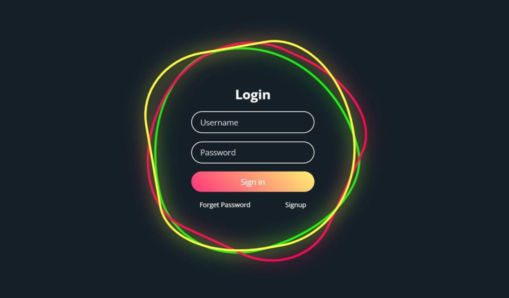
The project is an animated login page designed to provide an engaging and interactive experience for users. The aim is to combine modern design elements with smooth animations to make the login process visually appealing while ensuring usability. The page features rotating squares in the background and a sleek, minimalist login form that stands out with gradient buttons and clean input fields.
HTML :
<!DOCTYPE html>
<html lang="en">
<head>
	<meta charset="UTF-8">
	<meta http-equiv="X-UA-Compatible" content="IE=edge">
	<meta name="viewport" content="width=device-width, initial-scale=1.0">
	<link rel="stylesheet" href="style.css">
	<title>Animated Login Page</title>
</head>
<body>
	<div class="square">
		<i style="--clr:#00ff0a;"></i>
		<i style="--clr:#ff0057;"></i>
		<i style="--clr:#fffd44;"></i>
		<div class="login">
			<h2>Login</h2>
			<div class="inputBx">
				<input type="text" placeholder="Username">
			</div>
			<div class="inputBx">
				<input type="password" placeholder="Password">
			</div>
			<div class="inputBx">
				<input type="submit" value="Sign in">
			</div>
			<div class="links">
				<a href="#">Forget Password</a>
				<a href="#">Signup</a>
			</div>
		</div>
	</div>
</body>
</html>
Animation Effects
Hover Effects: When the user hovers over the square, the border color changes, and a glowing effect (drop-shadow) is applied, enhancing the interactive feel of the design.
Rotating Squares: The background uses @keyframes animations (animate and animate2) to rotate the squares at different speeds, creating a continuous and smooth rotation effect. The variation in speed and direction adds visual interest and depth.
CSS
@import url('https://fonts.googleapis.com/css?family=Open+Sans:400,600,700&display=swap');
*
{
	margin: 0;
	padding: 0;
	box-sizing: border-box;
	font-family: 'Open Sans', sans-serif;
}
body
{
	display: flex;
	justify-content: center;
	align-items: center;
	min-height: 100vh;
	background: #151f28;
}
.square
{
	position: relative;
	width: 500px;
	height: 500px;
	display: flex;
	justify-content: center;
	align-items: center;
}
.square i
{
	position: absolute;
	inset: 0;
	border: 2px solid #fff;
	transition: 0.5s;
}
.square i:nth-child(1)
{
	border-radius: 38% 62% 63% 37% / 41% 44% 56% 59%;
	animation: animate 6s linear infinite;
}
.square i:nth-child(2)
{
	border-radius: 41% 44% 56% 59%/38% 62% 63% 37%;
	animation: animate 4s linear infinite;
}
.square i:nth-child(3)
{
	border-radius: 41% 44% 56% 59%/38% 62% 63% 37%;
	animation: animate2 10s linear infinite;
}
.square:hover i
{
	border: 6px solid var(--clr);
	filter: drop-shadow(0 0 20px var(--clr));
}
@keyframes animate
{
	0%
	{
		transform: rotate(0deg);
	}
	100%
	{
		transform: rotate(360deg);
	}
}
@keyframes animate2
{
	0%
	{
		transform: rotate(360deg);
	}
	100%
	{
		transform: rotate(0deg);
	}
}
.login
{
	position: absolute;
	width: 300px;
	height: 100%;
	display: flex;
	justify-content: center;
	align-items: center;
	flex-direction: column;
	gap: 20px;
}
.login h2
{
	font-size: 2em;
	color: #fff;
}
.login .inputBx
{
	position: relative;
	width: 100%;
}
.login .inputBx input
{
	position: relative;
	width: 100%;
	padding: 12px 20px;
	background: transparent;
	border: 2px solid #fff;
	border-radius: 40px;
	font-size: 1.2em;
	color: #fff;
	box-shadow: none;
	outline: none;
}
.login .inputBx input[type="submit"]
{
	width: 100%;
	background: #0078ff;
	background: linear-gradient(45deg,#ff357a,#fff172);
	border: none;
	cursor: pointer;
}
.login .inputBx input::placeholder
{
	color: rgba(255,255,255,0.75);
}
.login .links
{
	position: relative;
	width: 100%;
	display: flex;
	align-items: center;
	justify-content: space-between;
	padding: 0 20px;
}
.login .links a
{
	color: #fff;
	text-decoration: none;
}
Conclusion
The animated login page effectively combines visual appeal with functionality. The rotating square animations create a dynamic background without distracting from the login form. The use of clean text and a vibrant gradient button ensures that the form is both engaging and easy to use. The design’s responsive and interactive elements provide a professional and modern user experience, demonstrating a strong understanding of HTML and CSS animation capabilities.