
Animated Login Signup Page Using Html , CSS & JS
Introduction
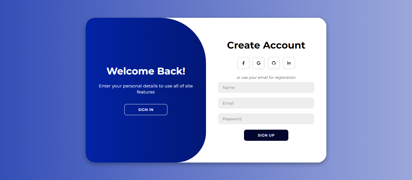
This project is an animated login page designed using HTML, CSS, and JavaScript. The page offers a smooth, dynamic experience where users can switch between the login and registration forms. The design is structured to be visually appealing with a coffee-themed color palette and animated elements that provide a lively interface.
HTML :
<!DOCTYPE html>
<html lang="en">
<head>
    <meta charset="UTF-8">
    <meta name="viewport" content="width=device-width, initial-scale=1.0">
    <link rel="stylesheet" href="https://cdnjs.cloudflare.com/ajax/libs/font-awesome/6.5.1/css/all.min.css">
    <link rel="stylesheet" href="style.css">
    <title>Animated Login Page</title>
</head>
<body>
    <div class="container" id="container">
        <div class="form-container sign-up">
            <form >
                <h1>Create Account</h1>
                <div class="social-icons">
                    <a href="#" class="social"><i class="fab fa-facebook-f"></i></a>
                    <a href="#" class="social"><i class="fa-brands fa-google"></i></a>
                    <a href="#" class="social"><i class="fab fa-linkedin-in"></i></a>
                </div>
                <span>or use your email for registration</span>
                <input type="text" placeholder="Name" />
                <input type="email" placeholder="Email" />
                <input type="password" placeholder="Password" />
                <button>Sign Up</button>
            </form>
        </div>
        <div class="form-container sign-in">
            <form>
                <h1>Sign In</h1>
                <div class="social-icons">
                    <a href="#" class="social"><i class="fab fa-facebook-f"></i></a>
                    <a href="#" class="social"><i class="fa-brands fa-google"></i></a>
                    <a href="#" class="social"><i class="fab fa-linkedin-in"></i></a>
                </div>
                <span>or use your email password</span>
                <input type="email" placeholder="Email" />
                <input type="password" placeholder="Password" />
                <a href="#">Forgot your password?</a>
                <button>Sign In</button>
            </form>
        </div>
        <div class="toggle-container">
            <div class="toggle">
                <div class="toggle-panel toggle-left">
                    <h1>Welcome Back!</h1>
                    <p>Enter your personal details to use all of site features</p>
                    <button class="hidden" id="login">Sign In</button>
                </div>
                <div class="toggle-panel toggle-right">
                    <h1>Hello, Friend!</h1>
                    <p>Register with your personal details to use all of site features</p>
                    <button class="hidden" id="register">Sign Up</button>
                </div>
            </div>
        </div>
    </div>

    <script src="script.js"></script>
</body>
</html>
Animation Effects
CSS transitions and keyframes manage the sliding animations of the forms and toggle panels. When switching between the “Sign Up” and “Sign In” forms, the container shifts, sliding the current form out while fading in the other. The toggle animation creates an engaging user experience, enhancing the interactivity of the design. JavaScript is used to add and remove classes (active) to control these animations based on user clicks.

CSS
@import url('https://fonts.googleapis.com/css2?family=Montserrat:ital,wght@0,100..900;1,100..900&display=swap');

* {
    margin: 0;
    padding: 0;
    box-sizing: border-box;
    font-family: 'Montserrat', sans-serif;
}

body {
    background-color: #e5d5c5; /* Light coffee cream */
    background: linear-gradient(to left, #f1e3d3, #c9ab8d); /* Light beige to soft brown */
    display: flex;
    align-items: center;
    justify-content: center;
    flex-direction: column;
    height: 100vh;
}

.container {
    background-color: #fff7ed; /* Very light beige */
    border-radius: 30px;
    box-shadow: 0 5px 15px rgba(0, 0, 0, 0.15);
    position: relative;
    overflow: hidden;
    width: 798px;
    max-width: 100%;
    min-height: 480px;
}

.container p {
    font-size: 14px;
    line-height: 20px;
    letter-spacing: 0.3px;
    margin: 20px 0;
    color: #5c3d2e; /* Soft coffee brown */
}

.container span {
    font-size: 12px;
    color: #5c3d2e; /* Soft coffee brown */
}

.container a {
    color: #5c3d2e; /* Soft coffee brown */
    font-size: 13px;
    text-decoration: none;
    margin: 15px 0 10px;
}

.container button {
    background-color: #8b634b; /* Light brown */
    color: #fff;
    font-size: 12px;
    padding: 10px 45px;
    border: 1px solid transparent;
    border-radius: 8px;
    font-weight: 600;
    letter-spacing: 0.5px;
    text-transform: uppercase;
    margin-top: 10px;
    cursor: pointer;
}

.container button.hidden {
    background-color: transparent;
    border-color: #fff;
}

.container form {
    background-color: #fff7ed; /* Very light beige */
    display: flex;
    align-items: center;
    justify-content: center;
    flex-direction: column;
    padding: 0 40px;
    height: 100%;
}

.container input {
    background-color: #e6d9cc; /* Light beige */
    border: none;
    margin: 8px 0;
    padding: 10px 15px;
    font-size: 13px;
    border-radius: 8px;
    width: 100%;
    outline: none;
}

.form-container {
    position: absolute;
    top: 0;
    height: 100%;
    transition: all 0.6s ease-in-out;
}

.sign-in {
    left: 0;
    width: 50%;
    z-index: 2;
}

.container.active .sign-in {
    transform: translateX(100%);
}

.sign-up {
    left: 0;
    width: 50%;
    opacity: 0;
    z-index: 1;
}

.container.active .sign-up {
    transform: translateX(100%);
    opacity: 1;
    z-index: 5;
    animation: move 0.6s;
}

@keyframes move {
    0%, 49.99% {
        opacity: 0;
        z-index: 1;
    }
    50%, 100% {
        opacity: 1;
        z-index: 5;
    }
}

.social-icons {
    margin: 20px 0;
}

.social-icons a {
    border: 1px solid #8b634b; /* Light brown */
    border-radius: 20%;
    display: inline-flex;
    justify-content: center;
    align-items: center;
    margin: 0 3px;
    width: 40px;
    height: 40px;
    color: #8b634b; /* Light brown */
}

.toggle-container {
    position: absolute;
    top: 0;
    left: 50%;
    width: 50%;
    height: 100%;
    overflow: hidden;
    transition: all 0.6s ease-in-out;
    border-radius: 150px 0 0 100px;
    z-index: 1000;
}

.container.active .toggle-container {
    transform: translateX(-100%);
    border-radius: 0 150px 100px 0;
}

.toggle {
    background-color: #c9ab8d; /* Soft brown */
    height: 100%;
    background: linear-gradient(to right, #d3b89c, #a47b61); /* Light to medium brown gradient */
    color: #fff;
    position: relative;
    left: -100%;
    height: 100%;
    width: 200%;
    transform: translateX(0);
    transition: all 0.6s ease-in-out;
}

.container.active .toggle {
    transform: translateX(50%);
}

.toggle-panel {
    position: absolute;
    width: 50%;
    height: 100%;
    display: flex;
    align-items: center;
    justify-content: center;
    flex-direction: column;
    padding: 0 30px;
    text-align: center;
    top: 0;
    transform: translateX(0);
    transition: all 0.6s ease-in-out;
}

.toggle-left {
    transform: translateX(-200%);
}

.container.active .toggle-left {
    transform: translateX(0);
}

.toggle-right {
    right: 0;
    transform: translateX(0);
}

.container.active .toggle-right {
    transform: translateX(200%);
}
At its core, the script listens for clicks on the “Sign Up” or “Sign In” buttons. When the user clicks “Sign Up,” JavaScript triggers an animation by adding the active class to the container. This causes the container to shift, revealing the sign-up form and hiding the sign-in form. Likewise, clicking the “Sign In” button removes the active class, sliding the container back to its original position, showing the sign-in form again.
JS :
const container = document.getElementById('container');
const registerBtn = document.getElementById('register');
const loginBtn = document.getElementById('login');

registerBtn.addEventListener('click', () => {
    container.classList.add("active");
});

loginBtn.addEventListener('click', () => {
    container.classList.remove("active");
});Color Scheme
A soft, coffee-themed color palette is applied throughout the design. The background features a gradient transitioning from light beige to soft brown, providing a warm and inviting look. The container and input fields are shaded in light beige tones for consistency, while the buttons and social icons use light brown shades to create contrast and focus.
Conclusion
This animated login page combines a clean structure with smooth animations and a warm color palette, resulting in an inviting and interactive user experience. The seamless transitions between forms and interactive elements, like social icons and buttons, enhance the overall design, making it engaging and functional.