
Today, we’re going to know How to make CSS Product Card Hover Effect | Sprit Ui Design Using Html and Css
Project Overview
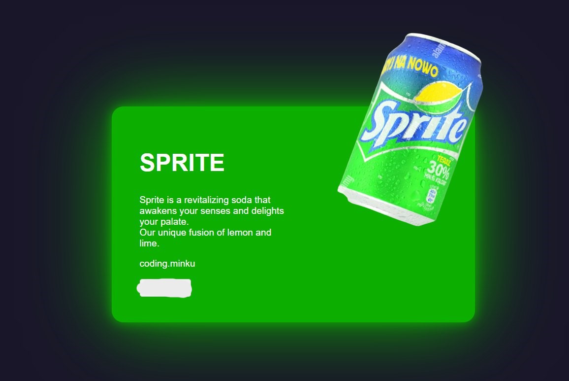
This project showcases a visually engaging and interactive card design for the Sprite beverage. Utilizing HTML, CSS, and JavaScript, the card features smooth animations and a modern aesthetic that aims to capture the viewer’s attention while providing essential product information. The design focuses on creating an immersive experience for the user, encouraging interaction through hover effects and dynamic transitions.
HTML :
<!DOCTYPE html>
<html lang="en">
<head>
    <meta charset="UTF-8">
    <meta name="viewport" content="width=device-width, initial-scale=1.0">
    <title>Sprite </title>
    <link rel="stylesheet" href="./assets/css/style.css">
</head>
<body>
    <div class="card">
        <div class="circle" style="--clr: #0cae00;">
          <img src="https://blogger.googleusercontent.com/img/b/R29vZ2xl/AVvXsEhonjfUpSJCHpycbX3HO2ik3EYl9b-RmIQitwc4xmZYGbkqXr7wXMfqItAT6Uxpqj3b-Mh2_6HQb_tsiEsmU2YIge5zilpRhpgb3LFGa3-_DvW048munF2IqOW_bbgLIBtU_PvG7-WVLFjf-zJs_Z1GqWQnY8QAz_VaMoQl5frznIcprxp-nrqwK0HzDaw/s1200/Sprite_2022.svg.png" class="logo">
        </div>
        <div class="content">
          <h2>SPRITE</h2>
          <p>Sprite is a revitalizing soda that awakens your senses and delights your palate. </br>Our unique fusion of lemon and lime.</p>
          <p>MzDevCode</p>
        <button style="padding:5px; font-size: 1em; border: 1px solid #ccc; border-radius: 4px;">View More</button>
        </div>
        <img src="https://blogger.googleusercontent.com/img/b/R29vZ2xl/AVvXsEjD7NbtGe13bMt4t0syaaIePNP83Piyf_i4MyN0EfAMJr9iH6ZFxGPljzeUf9aBW_vvJwZBI25lCIG1g5NmR5iZ0AnchS9Jncm8F8pp6ovMSkGBKY2RIVFmTdZLW_lTerAEomw2ondZwoEwADv7zljsqZ9OD9ChdHdDm-Fsq-DK6IrVNuHp8reYZ-CP4H4/s584/sprite-drink-in-a-can-on-ice-isolated-on-white-background-FT21NP-removebg-preview.png" class="product_img">
      </div>
</body>
</html>
Card Structure
The card is composed of the following main elements:
- Card Container: The main element that holds all other components. It is styled to be compact and centered on the page, with hover effects that expand its dimensions.
- Circle Element: This circular section contains the Sprite logo, designed to stand out with a glowing border. It serves as a focal point of the card, drawing the user’s attention.
- Content Section: Includes the product title, description, and a button for more information. This section remains hidden until the user hovers over the card.
- Product Image: Positioned to reveal itself smoothly during interactions. It enhances the visual appeal by displaying the product.
Animation Effects
- The animations incorporated into the card design enhance user experience through:
- Content Fade-in: The text and button fade in when hovered over, offering a sense of anticipation and encouraging users to engage further.
- Hover Expansion: Upon hovering, the card smoothly expands from a compact size to reveal more content, creating an engaging user interaction.
- Logo Transition: The circular logo area expands while the logo itself scales down, creating a dynamic effect that maintains user interest.
- Image Reveal: The product image initially remains hidden, then gradually rotates and scales into view when the card is hovered over. This playful movement adds depth to the interaction.
CSS
@import url("https://fonts.googleapis.com/css?famiyl=Poppins:200,300,400,500,600,700,800,900&display=swap");
* {
  margin: 10;
  padding-right: 0;
  box-sizing: border-box;
  font-family: "Poppins", sans-serif;
}
body {
  display: flex;
  justify-content: center;
  align-items: center;
  min-height: 100vh;
  background: #191629;
}
.card {
  position: relative;
  width: 350px;
  height: 350px;
  display: flex;
  justify-content: center;
  align-items: center;
  transition: 0.5s;
  transition-delay: 0.5s;
}
.card:hover {
  width: 600px;
  transition-delay: 0.5s;
}
.card .circle {
  position: absolute;
  top: 0;
  left: 0;
  width: 100%;
  height: 100%;
  border-radius: 20px;
  display: flex;
  justify-content: center;
  align-items: center;
}
.card .circle::before {
  content: "";
  position: absolute;
  top: 30;
  left: 2;
  right: 2;
  width: 350px;
  height: 350px;
  border-radius: 50%;
  background: #191919;
  border: 8px solid var(--clr);
  filter: drop-shadow(0 0 10px var(--clr)) drop-shadow(0 0 60px var(--clr));
  transition: 0.5s, background 0.5s;
  transition-delay: 0.75s, 1s;
}
.card:hover .circle::before {
  transition-delay: 0.5s;
  width: 100%;
  height: 100%;
  border-radius: 20px;
  background: var(--clr);
}
.card .circle .logo {
  position: relative;
  width: 250px;
  transition: 0.5s;
  transition-delay: 0.5s;
}
.card:hover .circle .logo {
  transform: scale(0);
  transition-delay: 0s;
}
.card .product_img {
  position: absolute;
  top: 50%;
  left: 50%;
  transform: translate(-50%, -50%) scale(0) rotate(315deg);
  height: 300px;
  transition: 0.5s ease-in-out;
}
.card:hover .product_img {
  transition-delay: 0.75s;
  top: 25%;
  left: 72%;
  height: 300px;
  transform: translate(-30%, -65%) scale(1) rotate(-55deg);
}
.card .content {
  position: absolute;
  width: 50%;
  left: 20%;
  padding: 20px 20px 20px 20px;
  opacity: 0;
  transition: 0.5s;
  visibility: hidden;
}
.card:hover .content {
  transition-delay: 0.75s;
  opacity: 1;
  visibility: visible;
  left: 20px;
}
.card .content h2 {
  color: #fff;
  text-transform: uppercase;
  font-size: 2.5em;
  line-height: 1em;
}
.card .content p {
  color: #fff;
}
.card .content a {
  position: relative;
  color: #111;
  background: #fff;
  padding: 10px 20px;
  border-radius: 10px;
  display: inline-block;
  text-decoration: none;
  font-weight: 600;
  margin-top: 10px;
}
Conclusion
The design of the Sprite card effectively combines structure, animation, and color to create a modern, interactive experience. By emphasizing user engagement through smooth transitions and visually appealing elements, the card not only showcases the product but also invites users to interact with the content. The thoughtful design choices contribute to an effective marketing tool that can attract attention in a competitive market.