

Today we Will Learn How To Make Glass Effect Navbar Using HTML & CSS
Overview:
Hey folks! Today we’re diving into creating a sleek and modern navbar using HTML and CSS, with a touch of that cool glass morphism effect. This design is perfect for adding a contemporary flair to your web projects.
HTML:
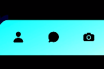
Our HTML is clean and semantic. We have a nav element that contains an unordered list (ul). Inside the ul, we have:
- Five menu items: Home, Mobile, Tablet, Laptop, and Help
- A logo item using a Font Awesome icon
<!DOCTYPE html>
<html lang="en">

<head>
    <meta charset="UTF-8">
    <title>mzdevcode</title>
    <link href="https://cdn.jsdelivr.net/npm/bootstrap-icons@1.7.2/font/bootstrap-icons.css" rel="stylesheet">
    <link rel="stylesheet" href="https://cdnjs.cloudflare.com/ajax/libs/font-awesome/5.15.3/css/all.min.css">
    <link rel="stylesheet" href="https://cdnjs.cloudflare.com/ajax/libs/font-awesome/6.5.2/css/all.min.css">
    <style>
        body {
            background-color: #000;
            display: grid;
            place-content: center;
            height: 100vh;
            margin: 0;
            font-family: sans-serif;
            /* background: linear-gradient(45deg, #00fffc, #000); */
            background: url(https://images.pexels.com/photos/2171277/pexels-photo-2171277.jpeg?auto=compress&cs=tinysrgb&w=1260&h=750&dpr=2);
            background-position: center;
            background-size: cover;
        }

        nav {
            /* backdrop-filter: blur(30px);
			-webkit-backdrop-filter: blur(3px); */
            border-radius: 5px;
            /* box-shadow:  10px 10px 30px 0 rgba(22, 32, 220, 0.37); */
            padding-right: 35px;
            /* border: 1px solid rgba(255, 255, 255, 0.18); */
            width: 1500px;
            height: 200px;
        }

        nav {
            backdrop-filter: blur(30px);
            box-shadow: 0px 0px 30px 0 rgba(227, 228, 237, 0.37);
            border: 2px solid rgba(255, 255, 255, 0.18);
        }

        ul {
            display: flex;
            gap: 5rem;
            list-style: none;
            justify-content: center;
            align-items: center;
            height: 85%;
        }

        ul li {
            color: #fff;
            display: grid;
            place-content: center;
            margin: 0;
        }

        .logo {
            /* color: #0f1cdd; */
            color: #fff;
            cursor: pointer;
            font-size: 5rem;
            position: relative;
            right: 15px;
        }

        .menu {
            color: #fff;
            padding: 0.5rem;
            position: relative;
            text-decoration: none;
            font-size: 50px;
        }

        .menu::before {
            content: "";
            position: absolute;
            width: 100%;
            height: 2px;
            background: #fff;
            border-radius: 5px;
            transform: scaleX(0);
            transition: all .5s ease;
            bottom: 0;
            left: 0;
        }

        .menu:hover::before {
            transform: scaleX(1);
        }
    </style>
</head>

<body>
    <nav>
        <ul>
            <li class="logo">
                <i class="fa-solid fa-store"></i>
            </li>
            <li><a href="" class="menu">Home</a> </li>
            <li><a href="" class="menu">Mobile</a></li>
            <li><a href="" class="menu">Tablet</a></li>
            <li><a href="" class="menu">Laptop</a></li>
            <li><a href="" class="menu">Help</a></li>
        </ul>
    </nav>

    <!-- <a id="source-link" class="meta-link" href="" target="_blank">
            <i class="fas fa-link"></i>
            <span class="roboto-mono">Join my Telegram</span>
        </a>

        <a id="yt-link" class="meta-link" href=""
            target="_blank">
            <i class="fab fa-youtube"></i>
            <span> Subscribe my channel</span>
        </a>

        <a id="Fund-link" class="meta-link" href=""
            target="_blank">
            <i class="fas fa-dollar-sign"></i>
            <span> Show your Support..❤</span>
        </a> -->
</body>

</html>
Cool Features:
- The navbar has rounded corners (border-radius: 5px) for a softer look.
- The body uses CSS Grid to center the navbar vertically and horizontally on the page.
- The menu items have a relatively large font size, making them stand out.
This navbar combines form and function beautifully. It’s not just visually appealing with its glass morphism style, but also fully functional. The large text and spacing make it perfect for a bold, modern website design.
Remember, the key to mastering these techniques is practice and experimentation. Feel free to adjust the blur intensity, change the background image, or add your own creative touches to make this navbar uniquely yours!
If Your Project is Not Working or Has Any Problem Don’t Worry, Just Click on Below Download Assets File And You Will Be Able To Get Full Control Of Our Projects , Then Customize And Use it For Your Coding Journey. Let the coding adventure begin!
By Downloading this assets You Will Be Able to create an Glass Effect Navbar Using HTML & CSS Which Can Be Used For Several Projects i.e. A Flutter App Using Vs Code or For Android App Using Android Studio And Also For Custom Web Development.