
Glass morphism Product Card Using Html And Css
Introduction:
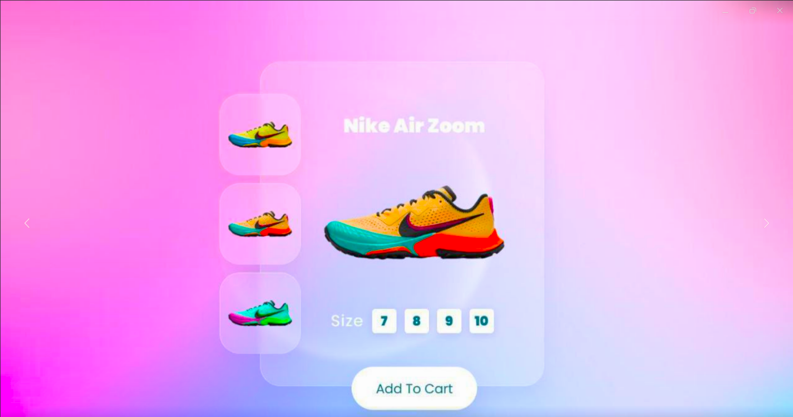
The Glass morphism Product Card project presents an aesthetically pleasing and interactive interface for showcasing a product—.. By leveraging glass morphism design principles, the card features translucent elements, vibrant imagery, and smooth animations to create an engaging user experience. The design effectively highlights product details and encourages user interaction through dynamic visual effects.
HTML :
<!DOCTYPE html>
<html lang="en">
<head>
    <meta charset="UTF-8">
    <meta http-equiv="X-UA-Compatible" content="IE=edge">
    <meta name="viewport" content="width=device-width, initial-scale=1.0">
    <title>Glassmorphism Product Card | </title>
    <link rel="stylesheet" href="style.css">
</head>
<body>
    <div class="container">
        <div class="thumb">
            <ul>
                <li onmouseover="chnageImgSrc('images/shoes1.png')"><img src="images/shoes1.png" alt=""></li>
                <li onmouseover="chnageImgSrc('images/shoes2.png')"><img src="images/shoes2.png" alt=""></li>
                <li onmouseover="chnageImgSrc('images/shoes3.png')"><img src="images/shoes3.png" alt=""></li>
            </ul>
        </div>
        <div class="imgBox">
            <h2>Nike Air Zoom</h2>
            <img src="images/shoes1.png" alt="" class="shoes">
            <ul class="sizes">
                <span>Size</span>
                <li>7</li>
                <li>8</li>
                <li>9</li>
                <li>10</li>
            </ul>
            <a href="#" class="btn">Add To Cart</a>
        </div>
    </div>


    <script>
        function chnageImgSrc(src) {
            document.querySelector('.shoes').src = src;
        }
    </script>
</body>
</html>
Color Scheme
The color palette enhances the overall design and emphasizes the glassmorphism effect:
Shadow and Border Effects: Subtle shadows and borders provide a layered effect, enhancing the glass-like appearance while keeping the design light and airy.
Background Image: The project features a full-screen background image that sets the mood and context.
Translucent Backgrounds: The card itself utilizes a semi-transparent white background (rgba(255, 255, 255, 0.2)), allowing the background image to show through and adding depth.

CSS
@import url('https://fonts.googleapis.com/css2?family=Poppins:ital,wght@0,400;0,600;0,900;1,900&display=swap');

* {
    margin: 0;
    padding: 0;
    box-sizing: border-box;
    font-family: 'Poppins', sans-serif;
}

body {
    display: flex;
    align-items: center;
    justify-content: center;
    min-height: 100vh;
    background: url(images/bg.jpg);
    background-size: cover;
    background-attachment: fixed;
}

.container {
    position: relative;
    width: 400px;
    height: 400px;
    /* background: #f00; */
}

.container .thumb {
    position: absolute;
    top: 50%;
    transform: translateY(-50%);
    z-index: 1;
}

.container .thumb li {
    list-style: none;
    width: 100px;
    height: 100px;
    /* background: #00f; */
    margin: 10px 0;
    display: flex;
    align-items: center;
    justify-content: center;
    background: rgba(255, 255, 255, 0.2);
    box-shadow: 0 15px 25px rgba(0, 0, 0, 0.05);
    border: 1px solid rgba(255, 255, 255, 0.25);
    border-top: 1px solid rgba(255, 255, 255, 0.5);
    border-left: 1px solid rgba(255, 255, 255, 0.5);
    border-radius: 25px;
    backdrop-filter: blur(4px);
}
.container .thumb li img {
    width: 80%;
    transition: 0.5s;
}

.container .thumb li:hover img {
    transform: rotate(-35deg);
}

.container .imgBox {
    position: absolute;
    top: 0;
    right: 0;
    width: 350px;
    height: 100%;
    /* background: #ff0; */
    background: rgba(255, 255, 255, 0.2);
    box-shadow: 0 15px 25px rgba(0, 0, 0, 0.05);
    border: 1px solid rgba(255, 255, 255, 0.25);
    border-top: 1px solid rgba(255, 255, 255, 0.5);
    border-left: 1px solid rgba(255, 255, 255, 0.5);
    border-radius: 25px;
    backdrop-filter: blur(4px);
    padding: 60px 20px;
    padding-left: 50px;
    display: flex;
    align-items: center;
    flex-direction: column;
    justify-content: space-between;
}

.container .imgBox h2 {
    color: #fff;
    letter-spacing: 1;
}

.container .imgBox img {
    width: 80%;
    transition: 0.25s;
}


.container .imgBox .sizes {
    display: flex;
    justify-content: center;
    align-items: center;
}

.container .imgBox .sizes span {
    color: #fff;
    font-size: 1.2em;
    letter-spacing: 1px;
    margin-right: 5px;
}

.container .imgBox img:hover {
    transform: scale(1.5) rotate(-15deg) translateX(20px);
}


.container .imgBox .sizes li {
    list-style: none;
    width: 30px;
    height: 30px;
    background: #fff;
    color: #1e6b7b;
    display: flex;
    justify-content: center;
    align-items: center;
    margin: 5px;
    border-radius: 4px;
    font-weight: 700;
    box-shadow: 0 2px 10px rgba(0, 0, 0, 0.1);
    cursor: pointer;
    transition: 0.25s;
}

.container .imgBox .sizes li:hover {
    transform: translateY(-10px);
}

.container .imgBox .btn {
    position: absolute;
    bottom: -30px;
    background: #fff;
    display: inline-block;
    text-decoration: none;
    padding: 15px 30px;
    border-radius: 30px;
    box-shadow: 0 15px 35px rgba(0, 0, 0, 0.1);
    font-weight: 500;
    color: #1e6b7b;
    transition: 0.25s;
}

.container .imgBox .btn:hover {
    letter-spacing: 2px;
}
Conclusion
The Glass morphism Product Card effectively combines modern design principles with user-friendly interactions to create an engaging product showcase. By integrating stylish animations, a clear structure, and an appealing color scheme, the design not only captivates users visually but also enhances usability. Overall, this project exemplifies how effective design can create an enjoyable shopping experience, inviting users to explore and interact with the product seamlessly.