
Glowing Light Login Form Using Html and Css
Today, we’re going to Built Glowing Light Login Form Using Html and Css.
Introduction
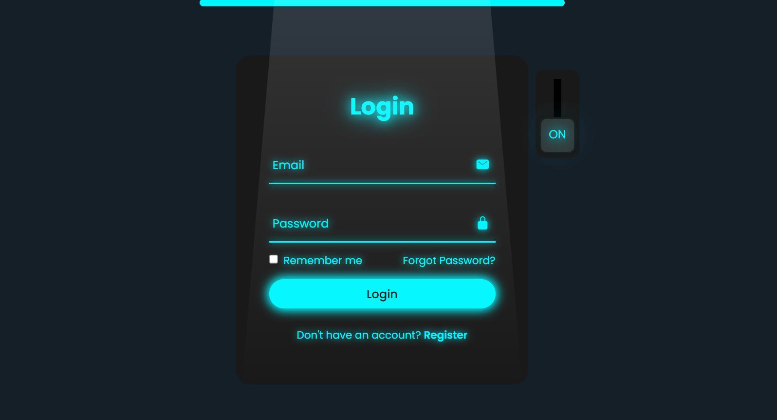
The project showcases a modern and interactive login form designed using HTML and CSS. The form features a sleek user interface with animated elements that enhance user experience. The design incorporates glowing effects and a toggle switch, allowing users to switch between different states of the form seamlessly. This project is an excellent demonstration of how to create visually appealing forms that engage users while maintaining functionality.
HTML :
<!DOCTYPE html>
<html lang="en">

<head>
    <meta charset="UTF-8">
    <meta http-equiv="X-UA-Compatible" content="IE=edge">
    <meta name="viewport" content="width=device-width, initial-scale=1.0">
    <title>Login Form Animation CSS | Mz Dev Code</title>
    <link rel="stylesheet" href="style.css">
</head>

<body>

    <div class="glowing-light"></div>
    <div class="login-box">
        <form action="#">
            <input type="checkbox" class="input-check" id="input-check">
            <label for="input-check" class="toggle">
                <span class="text off">off</span>
                <span class="text on">on</span>
            </label>
            <div class="light"></div>

            <h2>Login</h2>
            <div class="input-box">
                <span class="icon">
                    <ion-icon name="mail"></ion-icon>
                </span>
                <input type="email" required>
                <label>Email</label>
                <div class="input-line"></div>
            </div>
            <div class="input-box">
                <span class="icon">
                    <ion-icon name="lock-closed"></ion-icon>
                </span>
                <input type="password" required>
                <label>Password</label>
                <div class="input-line"></div>
            </div>
            <div class="remember-forgot">
                <label><input type="checkbox"> Remember me</label>
                <a href="#">Forgot Password?</a>
            </div>
            <button type="submit">Login</button>
            <div class="register-link">
                <p>Don't have an account? <a href="#">Register</a></p>
            </div>
        </form>
    </div>


    <script type="module" src="https://unpkg.com/ionicons@5.5.2/dist/ionicons/ionicons.esm.js"></script>
    <script nomodule src="https://unpkg.com/ionicons@5.5.2/dist/ionicons/ionicons.js"></script>
</body>

</html>
Animation Effects
The design incorporates various animations to create a dynamic user experience:
- Text Glow: The heading and labels exhibit a glowing effect through the use of
text-shadowwhen the toggle is activated. - Input Line Transition: The line beneath each input box changes color and adds a glow effect when the input field is focused or valid.
- Toggle Switch Animation: The switch slides smoothly when checked, with the accompanying text fading in and out, enhancing interactivity.
- Background Light Movement: The light effect above the login box moves when the toggle is activated, creating a visually engaging transition.
Text and Content Design
Text and content are styled for clarity and visual appeal:
- Font: The ‘Poppins’ font is used throughout the form for a modern and clean look.
- Label Positioning: Labels are initially positioned inside the input fields and move above when the user types, ensuring clear identification of input requirements.
- Color Transitions: Text color changes dynamically based on user interaction, enhancing readability and engagement.

CSS
@import url('https://fonts.googleapis.com/css2?family=Poppins:wght@300;400;500;600;700;800;900&display=swap');

* {
    margin: 0;
    padding: 0;
    box-sizing: border-box;
    font-family: 'Poppins', sans-serif;
}

body {
    display: flex;
    justify-content: center;
    align-items: center;
    min-height: 100vh;
    background: #151f28;
    overflow: hidden;
}

.login-box {
    position: relative;
    width: 400px;
    height: 450px;
    background: #191919;
    border-radius: 20px;
    display: flex;
    justify-content: center;
    align-items: center;
}

h2 {
    font-size: 2em;
    color: #fff;
    text-align: center;
    transition: .5s ease;
}

.input-check:checked~h2 {
    color: #00f7ff;
    text-shadow:
        0 0 15px #00f7ff,
        0 0 30px #00f7ff;
}

.input-box {
    position: relative;
    width: 310px;
    margin: 30px 0;
}

.input-box .input-line {
    position: absolute;
    bottom: -2px;
    left: 0;
    width: 100%;
    height: 2.5px;
    background: #fff;
    transition: .5s ease;
}

.input-check:checked~.input-box .input-line {
    background: #00f7ff;
    box-shadow: 0 0 10px #00f7ff;
}

.input-box label {
    position: absolute;
    top: 50%;
    left: 5px;
    transform: translateY(-50%);
    font-size: 1em;
    color: #fff;
    pointer-events: none;
    transition: .5s ease;
}

.input-box input:focus~label,
.input-box input:valid~label {
    top: -5px;
}

.input-check:checked~.input-box label {
    color: #00f7ff;
    text-shadow: 0 0 10px #00f7ff;
}

.input-box input {
    width: 100%;
    height: 50px;
    background: transparent;
    border: none;
    outline: none;
    font-size: 1em;
    color: #fff;
    padding: 0 35px 0 5px;
    transition: .5s ease;
}

.input-check:checked~.input-box input {
    color: #00f7ff;
    text-shadow: 0 0 5px #00f7ff;
}

.input-box .icon {
    position: absolute;
    right: 8px;
    color: #fff;
    font-size: 1.2em;
    line-height: 57px;
    transition: .5s ease;
}

.input-check:checked~.input-box .icon {
    color: #00f7ff;
    filter: drop-shadow(0 0 5px #00f7ff);
}

.remember-forgot {
    color: #fff;
    font-size: .9em;
    margin: -15px 0 15px;
    display: flex;
    justify-content: space-between;
    transition: .5s ease;
}

.input-check:checked~.remember-forgot {
    color: #00f7ff;
    text-shadow: 0 0 10px #00f7ff;
}

.remember-forgot label input {
    accent-color: #fff;
    margin-right: 3px;
    transition: .5s ease;
}

.input-check:checked~.remember-forgot label input {
    accent-color: #00f7ff;
}

.remember-forgot a {
    color: #fff;
    text-decoration: none;
    transition: color .5s ease;
}

.remember-forgot a:hover {
    text-decoration: underline;
}

.input-check:checked~.remember-forgot a {
    color: #00f7ff;
}

button {
    width: 100%;
    height: 40px;
    background: #fff;
    border: none;
    outline: none;
    border-radius: 40px;
    cursor: pointer;
    font-size: 1em;
    color: #191919;
    font-weight: 500;
    transition: .5s ease;
}

.glowing-light {
    position: absolute;
    top: 0;
    left: 50%;
    transform: translateX(-50%);
    width: 500px;
    height: 10px;
    background: #00f7ff;
    border-radius: 20px;
}

.input-check:checked~button {
    background: #00f7ff;
    box-shadow: 0 0 15px #00f7ff, 0 0 15px #00f7ff;
}

.register-link {
    color: #fff;
    font-size: .9em;
    text-align: center;
    margin: 25px 0 10px;
    transition: .5s ease;
}

.input-check:checked~.register-link {
    color: #00f7ff;
    text-shadow: 0 0 10px #00f7ff;
}

.register-link p a {
    color: #fff;
    text-decoration: none;
    font-weight: 600;
    transition: color .5s ease;
}

.register-link p a:hover {
    text-decoration: underline;
}

.input-check:checked~.register-link p a {
    color: #00f7ff;
}


.light {
    position: absolute;
    top: -200%;
    left: 0;
    width: 100%;
    height: 950px;
    background: linear-gradient(to bottom, rgba(255, 255, 255, .3) -50%, rgba(255, 255, 255, 0) 90%);
    clip-path: polygon(20% 0, 80% 0, 100% 100%, 0 100%);
    pointer-events: none;
    transition: .5s ease;
}

.input-check:checked~.light {
    top: -90%;
}

.toggle {
    position: absolute;
    top: 20px;
    right: -70px;
    width: 60px;
    height: 120px;
    background: #191919;
    border-radius: 10px;
}

.toggle::before {
    content: '';
    position: absolute;
    top: 50%;
    left: 50%;
    transform: translate(-50%, -50%);
    width: 10px;
    height: 80%;
    background: #000;
}

.toggle::after {
    content: '';
    position: absolute;
    top: 5px;
    left: 50%;
    transform: translateX(-50%);
    width: 45px;
    height: 45px;
    background: #333;
    border: 2px solid #191919;
    border-radius: 10px;
    cursor: pointer;
    box-shadow: 0 0 10px rgba(0, 0, 0, .5);
    transition: .5s ease;
}

.input-check:checked~.toggle::after {
    top: 65px;
}

.input-check {
    position: absolute;
    right: -70px;
    z-index: 1;
    opacity: 0;
}

.toggle .text {
    position: absolute;
    top: 17px;
    left: 50%;
    transform: translateX(-50%);
    color: #fff;
    font-size: 1em;
    z-index: 1;
    text-transform: uppercase;
    pointer-events: none;
    transition: .5s ease;
}

.toggle .text.off {
    opacity: 1;
}

.input-check:checked~.toggle .text.off {
    top: 76px;
    opacity: 0;
}

.toggle .text.on {
    opacity: 0;
}


.input-check:checked~.toggle .text.on {
    top: 76px;
    opacity: 1;
    color: #00f7ff;
    text-shadow:
        0 0 15px #00f7ff,
        0 0 30px #00f7ff,
        0 0 45px #00f7ff,
        0 0 60px #00f7ff;
}
Conclusion
The design effectively combines modern aesthetics with functional elements to create a user-friendly login form. The use of animations, glowing effects, and an intuitive layout not only attracts users but also guides them through the login process smoothly. This project serves as a perfect example of how design and interaction can enhance user experience while maintaining simplicity and elegance.