
How to Make 3D Hover Cards Using Html And Css and some js
Introduction
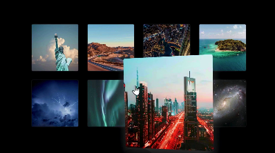
The HTML document creates a visually striking grid of photo cards using Vue.js, enhancing user interactivity with animations and a modern design. The layout is responsive, making it suitable for various screen sizes. The design includes social media links, allowing users to connect seamlessly.
HTML :
<!DOCTYPE html>
<html lang="en">

<head>
    <meta charset="UTF-8">
    <meta name="viewport" content="width=device-width, initial-scale=1.0">
    <title>@codewith_muhilan</title>
    <link rel="stylesheet" href="https://cdnjs.cloudflare.com/ajax/libs/font-awesome/5.15.3/css/all.min.css">

    <style>
        body {
            margin: 0;
            min-height: 100vh;
            display: flex;
            flex-direction: column;
            align-items: center;
            justify-content: center;
            background-color: #000;
            padding: 0 40px;
            font-family: "Source Sans Pro",
                Helvetica, sans-serif;
            font-weight: 300;
        }


        #grid {
            display: grid;
            grid-template-columns:
                repeat(auto-fill, 150px);
            grid-column-gap: 30px;
            grid-row-gap: 30px;
            align-items: center;
            justify-content: center;
            width: 100%;
            max-width: 700px;
        }


        #grid .card {
            background-color: #ccc;
            width: 150px;
            height: 150px;
            transition: all 0.1s ease;
            border-radius: 3px;
            position: relative;
            z-index: 1;
            box-shadow: 0 0 5px rgba(255, 255, 255, 0.2);
            overflow: hidden;
            cursor: pointer;
        }


        #grid .card:hover {
            transform: scale(2);
            z-index: 2;
            box-shadow: 0 10px 20px rgba(255, 255, 255, 0.2);
        }

        #grid .card:hover img {
            filter: grayscale(0);
        }


        #grid .card .reflection {
            position: absolute;
            width: 100%;
            height: 100%;
            z-index: 2;
            left: 0;
            top: 0;
            transition: all 0.1s ease;
            opacity: 0;
            mix-blend-mode: soft-light;
        }


        #grid .card img {
            width: 100%;
            height: 100%;
            -o-object-fit: cover;
            object-fit: cover;
            filter: grayscale(0.65);
            transition: all 0.3s ease;
        }

        /* -- External Social Link CSS Styles -- */

        #source-link {
            top: 120px;
        }

        #source-link>i {
            color: rgb(94, 106, 210);
        }

        #yt-link {
            top: 65px;
        }

        #yt-link>i {
            color: rgb(219, 31, 106);

        }

        #Fund-link {
            top: 10px;
        }

        #Fund-link>i {
            color: rgb(255, 251, 0);

        }

        .meta-link {
            align-items: center;
            backdrop-filter: blur(3px);
            background-color: rgba(255, 255, 255, 0.05);
            border: 1px solid rgba(255, 255, 255, 0.1);
            border-radius: 6px;
            box-shadow: 2px 2px 2px rgba(0, 0, 0, 0.1);
            cursor: pointer;
            display: inline-flex;
            gap: 5px;
            left: 10px;
            padding: 10px 20px;
            position: fixed;
            text-decoration: none;
            transition: background-color 600ms, border-color 600ms;
            z-index: 10000;
        }

        .meta-link:hover {
            background-color: rgba(255, 255, 255, 0.1);
            border: 1px solid rgba(255, 255, 255, 0.2);
        }

        .meta-link>i,
        .meta-link>span {
            height: 20px;
            line-height: 20px;
        }

        .meta-link>span {
            color: white;
            font-family: "Rubik", sans-serif;
            transition: color 600ms;
        }
    </style>
</head>

<body>

    <div class="grid" id="grid">
        <photo-card
            img="https://images.pexels.com/photos/290386/pexels-photo-290386.jpeg?auto=compress&cs=tinysrgb&w=1260&h=750&dpr=2"></photo-card>
        <photo-card
            img="https://images.pexels.com/photos/844167/pexels-photo-844167.jpeg?auto=compress&cs=tinysrgb&w=1260&h=750&dpr=2"></photo-card>
        <photo-card
            img="https://images.pexels.com/photos/1467300/pexels-photo-1467300.jpeg?auto=compress&cs=tinysrgb&w=1260&h=750&dpr=2"></photo-card>
        <photo-card
            img="https://images.pexels.com/photos/1139040/pexels-photo-1139040.jpeg?auto=compress&cs=tinysrgb&w=800"></photo-card>
        <photo-card
            img="https://images.pexels.com/photos/2531709/pexels-photo-2531709.jpeg?auto=compress&cs=tinysrgb&w=1260&h=750&dpr=2"></photo-card>
        <photo-card
            img="https://images.pexels.com/photos/1819650/pexels-photo-1819650.jpeg?auto=compress&cs=tinysrgb&w=1260&h=750&dpr=2"></photo-card>
        <photo-card
            img="https://images.pexels.com/photos/2403251/pexels-photo-2403251.jpeg?auto=compress&cs=tinysrgb&w=1260&h=750&dpr=2"></photo-card>
        <photo-card
            img="https://images.pexels.com/photos/2150/sky-space-dark-galaxy.jpg?auto=compress&cs=tinysrgb&w=1260&h=750&dpr=2"></photo-card>
    </div>


    <!--Social Liks codings below-->
    <a id="source-link" class="meta-link" href="https://t.me/codewith_muhilan" target="_blank">
        <i class="fas fa-link"></i>
        <span class="roboto-mono">Join my Telegram</span>
    </a>

    <a id="yt-link" class="meta-link" href="https://www.youtube.com/@codewith_muhilan?sub_confirmation=1"
        target="_blank">
        <i class="fab fa-youtube"></i>
        <span> Subscribe my channel</span>
    </a>

    <a id="Fund-link" class="meta-link" href="https://www.buymeacoffee.com/codewithmuhilan"
        target="_blank">
        <i class="fas fa-dollar-sign"></i>
        <span> Show your Support..❤</span>
    </a>

    <script src="https://cdnjs.cloudflare.com/ajax/libs/vue/2.6.10/vue.min.js"></script>
    <script>
        Vue.component("photo-card", {
            template: `<a class="card"
                :href="link"
                target="_blank"
                ref="card"
                @mousemove="move"
                @mouseleave="leave"
                @mouseover="over">
                  <div class="reflection" ref="refl"></div>
                  <img :src="img"/>
            </a>`,
            props: ["img", "link"],
            mounted() { },
            data: () => ({
                debounce: null
            }),

            methods: {
                over() {
                    const refl = this.$refs.refl;
                    refl.style.opacity = 1;
                },
                leave() {
                    const card = this.$refs.card;
                    const refl = this.$refs.refl;
                    card.style.transform = `perspective(500px) scale(1)`;
                    refl.style.opacity = 0;
                },

                move() {
                    const card = this.$refs.card;
                    const refl = this.$refs.refl;

                    const relX = (event.offsetX + 1) / card.offsetWidth;
                    const relY = (event.offsetY + 1) / card.offsetHeight;
                    const rotY = `rotateY(${(relX - 0.5) * 60}deg)`;
                    const rotX = `rotateX(${(relY - 0.5) * -60}deg)`;
                    card.style.transform = `perspective(500px) scale(2) ${rotY} ${rotX}`;

                    const lightX = this.scale(relX, 0, 1, 150, -50);
                    const lightY = this.scale(relY, 0, 1, 30, -100);
                    const lightConstrain = Math.min(Math.max(relY, 0.3), 0.7);
                    const lightOpacity = this.scale(lightConstrain, 0.3, 1, 1, 0) * 255;
                    const lightShade = `rgba(${lightOpacity}, ${lightOpacity}, ${lightOpacity}, 1)`;
                    const lightShadeBlack = `rgba(0, 0, 0, 1)`;
                    refl.style.backgroundImage = `radial-gradient(circle at ${lightX}% ${lightY}%, ${lightShade} 20%, ${lightShadeBlack})`;
                },
                scale: (val, inMin, inMax, outMin, outMax) =>
                    outMin + (val - inMin) * (outMax - outMin) / (inMax - inMin)
            }
        });


        const app = new Vue({
            el: "#grid"
        });
    </script>
</body>

</html>
Animation Effects
- The card animations enhance user interaction:
- Perspective Transform: The card rotates based on mouse movement, creating a 3D effect that captivates users.
- Hover Scaling: Cards enlarge on hover, providing a more dynamic user experience.
- Image Grayscale Transition: The image shifts from grayscale to color when hovered over, emphasizing engagement.
- Reflection Animation: The reflection effect appears with a smooth transition, adding depth to the visual presentation.
Conclusion
This project effectively combines aesthetic appeal with functional design elements. The card layout, complemented by animations and a well-defined color scheme, creates an engaging user experience. The inclusion of social media links further enhances connectivity, making it a versatile component for any website.