
Today we Will Learn How to Make Responsive Circular Menu Using Html , CSS & JS .
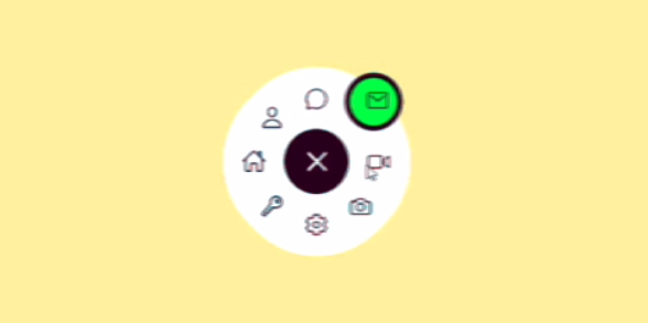
Let’s create a Circular Animated Menu using HTML, CSS, and JavaScript. This project will create an interactive and visually appealing circular menu that expands when clicked, adding a dynamic and engaging element to your website.
We’ll use HTML to structure the menu items, CSS to style the circular layout and animations, and JavaScript to handle the interactivity.
Let’s dive into building this Circular Animated Menu. Whether you’re a beginner or an experienced developer, this project offers a great opportunity to practice creating visually engaging user interface elements. Let’s make navigating through options a visually exciting experience!
HTML:
This HTML code sets up a webpage with a circular menu. The menu consists of a central toggle button and eight menu items, each represented by an icon. It includes links to an external stylesheet (style.css) and a JavaScript file (script.js) for styling and functionality. The page is designed to feature a dynamic, expanding circular menu that responds to user interactions.
<!DOCTYPE html>
<html lang="en">
<head>
    <meta charset="UTF-8">
    <meta name="viewport" content="width=device-width, initial-scale=1.0">
    <title>Document</title>
    <link rel="stylesheet" href="style.css">
</head>
<body>
    <div class="container">
        <ul class="menu">
          <div class="toggle">
            <ion-icon name="add-outline"></ion-icon>
          </div>
          <li style="--i:0" class="active">
            <a data-url="#">
              <ion-icon name="home-outline"></ion-icon>
            </a>
          </li>
          <li style="--i:1">
            <a data-url="#">
              <ion-icon name="person-outline"></ion-icon>
            </a>
          </li>
          <li style="--i:2">
            <a data-url="#">
              <ion-icon name="chatbubble-outline"></ion-icon>
            </a>
          </li>
          <li style="--i:3">
            <a data-url="#">
              <ion-icon name="mail-outline"></ion-icon>
            </a>
          </li>
          <li style="--i:4">
            <a data-url="#">
              <ion-icon name="videocam-outline"></ion-icon>
            </a>
          </li>
          <li style="--i:5">
            <a data-url="#">
              <ion-icon name="camera-outline"></ion-icon>
            </a>
          </li>
          <li style="--i:6">
            <a data-url="#">
              <ion-icon name="settings-outline"></ion-icon>
            </a>
          </li>
          <li style="--i:7">
            <a data-url="#">
              <ion-icon name="key-outline"></ion-icon>
            </a>
          </li>
          <div class="indicator"></div>
        </ul>
      </div>
      <script src="script.js"></script>
      <script type="module" src="https://unpkg.com/ionicons@5.5.2/dist/ionicons/ionicons.esm.js"></script>
<script nomodule src="https://unpkg.com/ionicons@5.5.2/dist/ionicons/ionicons.js"></script>

</body>
</html>
CSS:
This CSS stylesheet styles the circular menu with a clean, modern look. It sets up the initial hidden state of the menu items and defines animations for revealing them in a circular pattern. The stylesheet uses custom properties (CSS variables) for dynamic positioning, applies transitions for smooth animations, and includes styles for an indicator that highlights the active menu item. The layout is responsive and centered on the page.
* {
    margin: 0;
    padding: 0;
    box-sizing: border-box;
  }
  .container {
    width: 100%;
    min-height: 100vh;
    display: flex;
    justify-content: center;
    align-items: center;
    background:wheat;
  }
  .menu {
    position: relative;
    width: 300px;
    height: 300px;
    display: flex;
    align-items: center;
    justify-content: center;
  }
  .menu .toggle {
    position: absolute;
    width: 75px;
    height: 75px;
    display: flex;
    align-items: center;
    justify-content: center;
    color: #222;
    background: #fff;
    font-size: 3em;
    cursor: pointer;
    border-radius: 50%;
    transition: 0.5s;
  }
  .menu .toggle.active {
    transform: rotate(315deg);
    box-shadow: 0 0 0 68px #fff;
    color: #fff;
    background: #222237;
  }
  .menu li {
    position: absolute;
    left: 10px;
    list-style: none;
    transform: rotate(calc(360deg / 8 * var(--i))) translateX(40px);
    transform-origin: 140px;
    visibility: hidden;
    opacity: 0;
    z-index: 10;
    transition: 0.5s;
  }
  .menu.active li {
    visibility: visible;
    opacity: 1;
  }
  .menu li a {
    display: flex;
    justify-content: center;
    align-items: center;
    width: 55px;
    height: 55px;
    font-size: 1.75em;
    color: #222237;
    transform: rotate(calc(360deg / -8 * var(--i)));
    border-radius: 50%;
  }
  .menu.active li.active {
    transform: rotate(calc(360deg / 8 * var(--i))) translateX(12px);
  }
  .indicator {
    position: absolute;
    left: calc(50% - 2.5px);
    transform-origin: right;
    width: 100px;
    height: 1px;
    background: transparent;
    pointer-events: none;
    transition: 0.5s;
  }
  .indicator::before {
    content: "";
    position: absolute;
    top: -27px;
    left: 72px;
    width: 55px;
    height: 55px;
    background: #222237;
    border-radius: 50%;
    box-shadow: 0 0 0 6px #29fd53;
    opacity: 0;
    transition: 0.5s;
  }
  .menu.active .indicator::before {
    opacity: 1;
    top: -27.5px;
    left: -25px;
    background: #29fd53;
    box-shadow: 0 0 0 6px #222237;
  }
  .menu li:nth-child(2).active ~ .indicator {
    transform: translateX(-100px) rotate(0deg);
  }
  .menu li:nth-child(3).active ~ .indicator {
    transform: translateX(-100px) rotate(45deg);
  }
  .menu li:nth-child(4).active ~ .indicator {
    transform: translateX(-100px) rotate(90deg);
  }
  .menu li:nth-child(5).active ~ .indicator {
    transform: translateX(-100px) rotate(135deg);
  }
  .menu li:nth-child(6).active ~ .indicator {
    transform: translateX(-100px) rotate(180deg);
  }
  .menu li:nth-child(7).active ~ .indicator {
    transform: translateX(-100px) rotate(225deg);
  }
  .menu li:nth-child(8).active ~ .indicator {
    transform: translateX(-100px) rotate(270deg);
  }
  .menu li:nth-child(9).active ~ .indicator {
    transform: translateX(-100px) rotate(315deg);
  }
JS:
This JavaScript file adds interactivity to the circular menu. It handles the toggling of the menu’s active state, manages the selection of menu items, and updates the indicator position. The script uses event listeners to respond to user clicks, adding and removing classes to trigger CSS animations and state changes.
let menuToggle = document.querySelector(".toggle");
let menu = document.querySelector(".menu");
menuToggle.onclick = function () {
  menu.classList.toggle("active");
  menuToggle.classList.toggle("active");
};
let list = document.querySelectorAll(".menu li");
function activeLink() {
  list.forEach((item) => {
    item.classList.remove("active");
    this.classList.add("active");
  });
}
list.forEach((item) => {
  item.addEventListener("click", activeLink);
});
If Your Project is Not Working or Has Any Problem Don’t Worry, Just Click on Below Download Assets File And You Will Be Able To Get Full Control Of Our Projects , Then Customize And Use it For Your Coding Journey. Let the coding adventure begin!
Conclusion:
In conclusion, creating this Circular Animated Menu using HTML, CSS, and JavaScript has been an exciting and educational journey. By combining structural HTML, stylish CSS animations, and interactive JavaScript, we’ve learned how to create an engaging user interface element that responds dynamically to user actions.
By Downloading this assets You Will Be Able to Create Your own Bottom Menu (Footer) Using Html , Which Can Be Used For Several Projects i.e. A Flutter App Using Vs Code or For Android App Using Android Studio And Also For Custom Web Development.