
Today we Will Learn How To Make Liquid Drop Login Form using Html and CSS.
HTML Overview:
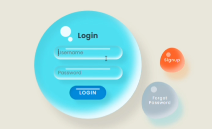
The HTML for this project creates a structured layout for our Liquid Drop Login Form. It includes a container that houses the main “drop” element, which serves as the centerpiece of our design. Within this drop, we’ve placed a login form with input fields for the username and password, as well as a submit button.
Outside the main drop, we’ve added two additional elements: a “Forgot Password” link and a “Signup” button. These elements are positioned strategically to complement the overall design while providing essential functionality.
The HTML structure is clean and semantic, ensuring that the content is well-organized and accessible. This foundation allows us to apply our CSS styles effectively, creating the visual magic of the liquid drop effect.
<!DOCTYPE html>
<html lang="en">
    <!-- coding by MZDEVCODE -->

<head>
    <meta charset="UTF-8">
    <meta http-equiv="X-UA-Compatible" content="IE=edge">
    <meta name="viewport" content="width=device-width, initial-scale=1.0">
    <title>Liquid Drop Login Page</title>
    <link rel="stylesheet" href="style.css">
</head>
<body>
    <div class="container">
        <div class="drop">
            <div class="content">
                <h2 class='animate__heartBeat'>Login</h2>
                <form>
                    <div class="input-box">
                        <input type="text" placeholder="Username">
                    </div>
                    <div class="input-box">
                        <input type="password" placeholder="Password">
                    </div>
                    <div class="input-box">
                        <input type="submit" value="Login" href='#'>
                    </div>
                </form>
            </div>
        </div>
        <a href="#" class='btn'>Forgot Password</a>
        <a href="#" class='btn signup'>Signup</a>
    </div>
    </body>
    </html>
CSS:
Font Integration: We’ve imported the ‘Poppins’ font from Google Fonts, providing a modern and clean typography for our form. Flexbox Layout: The body of the page uses flexbox to center the form both vertically and horizontally, ensuring a balanced and responsive layout. Liquid Drop Effect: The main drop is created using a combination of border-radius and box-shadow properties. By using percentage values for border-radius, we achieve an organic, asymmetrical shape that resembles a liquid droplet. Multiple layers of box-shadow create depth and a 3D effect, enhancing the liquid appearance.
/* Follow the below pattern to import any font from google fonts  */
@import url('https://fonts.googleapis.com/css?family=Poppins:200,300,400,500,600,700,800,900&display=swap');

* {
    margin: 0;
    padding: 0;
    box-sizing: border-box;
    font-family: 'Poppins', sans-serif;
}

body {
    display: flex;
    justify-content: center;
    align-items: center;
    min-height: 100vh;
    background: #e7e7d9; /* Keeping original background color */
}

.container {
    position: relative;
    left: -80px;
    display: flex;
    justify-content: center;
    align-items: center;
}

.container .drop {
    position: relative;
    width: 350px;
    height: 350px;
    background: #80DEEA; /* Muted Aqua for liquid drop */
    box-shadow: inset 20px 20px 20px rgba(0, 0, 0, 0.05), 25px 35px 20px rgba(0, 0, 0, 0.05), 25px 30px 30px rgba(0, 0, 0, 0.05),
        inset -20px -20px 25px rgba(255, 255, 255, 0.9);
    transition: 0.5s;
    display: flex;
    justify-content: center;
    align-items: center;
    border-radius: 62% 38% 24% 76% / 59% 60% 40% 41%;
}

.container .drop:hover {
    border-radius: 50%;
}

.container .drop::before {
    content: '';
    position: absolute;
    top: 50px;
    left: 85px;
    width: 35px;
    height: 35px;
    border-radius: 50%;
    background: #fff;
    opacity: 0.9;
}

.container .drop::after {
    content: '';
    position: absolute;
    top: 85px;
    left: 110px;
    width: 15px;
    height: 15px;
    border-radius: 50%;
    background: #fff;
    opacity: 0.9;
}

.container .drop .content {
    position: relative;
    display: flex;
    justify-content: center;
    align-items: center;
    flex-direction: column;
    text-align: center;
    padding: 40px;
    gap: 15px;
}

.container .drop .content h2 {
    position: relative;
    color: #37474F; /* Dark Slate for text */
    font-size: 1.5em;
}

.container .drop .content form {
    display: flex;
    flex-direction: column;
    gap: 20px;
    justify-content: center;
    align-items: center;
}

.container .drop .content form .input-box {
    position: relative;
    width: 225px;
    box-shadow: inset  2px 5px 10px rgba(0, 0, 0, 0.1),
        inset -2px -5px 10px rgba(255, 255, 255, 1), 15px 15px 10px rgba(0, 0, 0, 0.05), 15px 10px 15px rgba(0, 0, 0, 0.025);
    border-radius: 25px;
}

.container .drop .content form .input-box::before {
    content: '';
    position: absolute;
    top: 8px;
    left: 50%;
    transform: translateX(-50%);
    width: 65%;
    height: 5px;
    background: rgba(255, 255, 255, 0.5);
    border-radius: 5px;
}

.container .drop .content form .input-box input {
    border: none;
    outline: none;
    background: transparent;
    width: 100%;
    font-size: 1em;
    padding: 10px 15px;
}

.container .drop .content form .input-box input[type='submit'] {
    color: #fff;
    text-transform: uppercase;
    font-size: 1em;
    cursor: pointer;
    letter-spacing: 0.1em;
    font-weight: 500;
}

.container .drop .content form .input-box:last-child {
    width: 120px;
    background: #0288D1; /* Deep Blue for login button */
    box-shadow: inset 2px 5px 10px rgba(0, 0, 0, 0.1),
        15px 15px 10px rgba(0, 0, 0, 0.05), 15px 10px 15px rgba(0, 0, 0, 0.025);
    transition: 0.5s;
}

.container .drop .content form .input-box:last-child:hover {
    width: 150px;
}

.btn {
    position: absolute;
    right: -120px;
    bottom: 0;
    width: 120px;
    height: 120px;
    background: #B0BEC5; /* Calm Grey for forget password */
    display: flex;
    justify-content: center;
    align-items: center;
    cursor: pointer;
    text-decoration: none;
    color: #fff;
    line-height: 1.2em;
    letter-spacing: 0.1em;
    font-size: 0.8em;
    transition: 0.25s;
    text-align: center;
    box-shadow: inset 10px 10px 10px rgba(0, 180, 216, 0.05), 15px 25px 10px rgba(0, 180, 216, 0.1), 15px 20px 20px rgba(0, 180, 216, 0.1),
        inset -10px -10px 15px rgba(255, 255, 255, 0.5);
    border-radius: 44% 56% 65% 35% / 57% 58% 42% 43%;
}

.btn::before {
    content: '';
    position: absolute;
    top: 15px;
    left: 30px;
    width: 20px;
    height: 20px;
    border-radius: 50%;
    background: #fff;
    opacity: 0.45;
}

.btn.signup {
    bottom: 150px;
    right: -140px;
    width: 80px;
    height: 80px;
    border-radius: 49% 51% 52% 48% / 63% 59% 41% 37%;
    background: #FF7043; /* Bright Orange for signup button */
    box-shadow: inset 10px 10px 10px rgba(247, 127, 0, 0.05), 15px 25px 10px rgba(247, 127, 0, 0.1), 15px 20px 20px rgba(247, 127, 0, 0.1),
        inset -10px -10px 15px rgba(255, 255, 255, 0.5);

}

.btn.signup::before {
    left: 20px;
    width: 15px;
    height: 15px;
}

.btn:hover {
    border-radius: 50%;
}
Remember, the key to mastering these techniques is practice and experimentation. Feel free to adjust the blur intensity, change the background image, or add your own creative touches to make this navbar uniquely yours!
If Your Project is Not Working or Has Any Problem Don’t Worry, Just Click on Below Download Assets File And You Will Be Able To Get Full Control Of Our Projects , Then Customize And Use it For Your Coding Journey. Let the coding adventure begin!
By Downloading this assets You Will Be Able to create an Glass Effect Navbar Using HTML & CSS Which Can Be Used For Several Projects i.e. A Flutter App Using Vs Code or For Android App Using Android Studio And Also For Custom Web Development.
Conclusion
Creating a Liquid Drop Login Form using HTML and CSS has been an exciting project that showcases the power of modern web design techniques. By combining creative use of CSS properties like border-radius, box-shadow, and transitions, we’ve transformed a standard login form into a unique and engaging web experience.