
Creating a Modern Navigation Menu with Glowing Indicator
Introduction:
Let’s dive into an exciting project: creating a Modern Navigation Menu using HTML, CSS, and JavaScript. This project features an interactive navigation bar with a sleek design, smooth animations, and a glowing indicator that moves as you switch between menu items. Whether you’re new to web development or have some experience, this project offers a great way to practice CSS animations and create a visually engaging user interface element.
Project Overview:
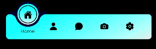
Our Modern Navigation Menu consists of five items: Home, Profile, Message, Photos, and Settings. Each item is represented by an icon and text, with a unique hover effect that reveals the text and creates a circular outline around the icon. The standout feature is the glowing indicator that smoothly transitions between menu items when clicked, providing clear visual feedback to the user.
HTML:
The HTML structure sets up the navigation menu within a container, using unordered lists and list items for each menu option. Each item contains an icon (using Ion icons), text, and a circular element for the hover effect. The indicator is a separate element that moves along the menu.
<!DOCTYPE html>
<html lang="en">

<head>
    <meta charset="UTF-8">
    <meta http-equiv="X-UA-Compatible" content="IE=edge">
    <meta name="viewport" content="width=device-width, initial-scale=1.0">
    <title>@codewith_muhilan</title>
    <link rel="stylesheet" href="https://cdnjs.cloudflare.com/ajax/libs/font-awesome/5.15.3/css/all.min.css">

    <style>
        @import url('https://fonts.googleapis.com/css2?family=Poppins:wght@300;400;500;600;700;800;900&display=swap');

        * {
            margin: 0;
            padding: 0;
            box-sizing: border-box;
            font-family: 'Poppins', sans-serif;
        }

        body {
            display: flex;
            justify-content: center;
            align-items: center;
            min-height: 100vh;
            background: #000000;
        }

        .navigation {
            position: relative;
            width: 400px;
            height: 70px;
            background:
                linear-gradient(155deg,
                    #00fffc, #eee);
            display: flex;
            justify-content: center;
            align-items: center;
            border-radius: 10px;
        }

        .navigation ul {
            display: flex;
            width: 350px;
        }

        .navigation ul li {
            position: relative;
            width: 70px;
            height: 70px;
            list-style: none;
            z-index: 1;
        }

        .navigation ul li a {
            position: relative;
            display: flex;
            justify-content: center;
            align-items: center;
            flex-direction: column;
            width: 100%;
            text-align: center;
            font-weight: 500;
        }

        .navigation ul li a .icon {
            position: relative;
            display: block;
            line-height: 75px;
            font-size: 1.5em;
            text-align: center;
            color: #000;
            transition: .5s;
        }

        .navigation ul li.active a .icon {
            transform: translateY(-32px);
        }

        .navigation ul li a .text {
            position: absolute;
            color: #000;
            font-weight: 400;
            font-size: .75em;
            letter-spacing: .05em;
            opacity: 0;
            transform: translateY(20px);
            transition: .5s;
        }

        .navigation ul li.active a .text {
            opacity: 1;
            transform: translateY(10px);
        }

        .navigation ul li a .circle {
            position: absolute;
            display: block;
            width: 50px;
            height: 50px;
            background: transparent;
            border-radius: 50%;
            border: 1.8px solid #000;
            transform: translateY(-37px) scale(0);
        }

        .navigation ul li.active a .circle {
            transition: .5s;
            transition-delay: .5s;
            transform: translateY(-37px) scale(1);
        }

        .indicator {
            position: absolute;
            top: -50%;
            width: 70px;
            height: 70px;
            background:
                linear-gradient(0deg,
                    #eee, #00fffc);
            border: 6px solid #06021b;
            border-radius: 50%;
            display: flex;
            justify-content: center;
            align-items: center;
            transition: .5s;
        }

        .indicator::before {
            content: '';
            position: absolute;
            top: 50%;
            left: -22px;
            width: 20px;
            height: 20px;
            background: transparent;
            border-top-right-radius: 20px;
            box-shadow: 1px -10px 0 #06021b;
        }

        .indicator::after {
            content: '';
            position: absolute;
            top: 50%;
            right: -22px;
            width: 20px;
            height: 20px;
            background: transparent;
            border-top-left-radius: 20px;
            box-shadow: -1px -10px 0 #06021b;
        }

        .navigation ul li:nth-child(1).active~.indicator {
            transform: translateX(calc(70px * 0));
        }

        .navigation ul li:nth-child(2).active~.indicator {
            transform: translateX(calc(70px * 1));
        }

        .navigation ul li:nth-child(3).active~.indicator {
            transform: translateX(calc(70px * 2));
        }

        .navigation ul li:nth-child(4).active~.indicator {
            transform: translateX(calc(70px * 3));
        }

        .navigation ul li:nth-child(5).active~.indicator {
            transform: translateX(calc(70px * 4));
        }

        /* -- External Social Link CSS Styles -- */

        #source-link {
            top: 120px;
        }

        #source-link>i {
            color: rgb(94, 106, 210);
        }

        #yt-link {
            top: 65px;
        }

        #yt-link>i {
            color: rgb(219, 31, 106);

        }

        #Fund-link {
            top: 10px;
        }

        #Fund-link>i {
            color: rgb(255, 251, 0);

        }

        .meta-link {
            align-items: center;
            backdrop-filter: blur(3px);
            background-color: rgba(255, 255, 255, 0.05);
            border: 1px solid rgba(255, 255, 255, 0.1);
            border-radius: 6px;
            box-shadow: 2px 2px 2px rgba(0, 0, 0, 0.1);
            cursor: pointer;
            display: inline-flex;
            gap: 5px;
            left: 10px;
            padding: 10px 20px;
            position: fixed;
            text-decoration: none;
            transition: background-color 600ms, border-color 600ms;
            z-index: 10000;
        }

        .meta-link:hover {
            background-color: rgba(255, 255, 255, 0.1);
            border: 1px solid rgba(255, 255, 255, 0.2);
        }

        .meta-link>i,
        .meta-link>span {
            height: 20px;
            line-height: 20px;
        }

        .meta-link>span {
            color: white;
            font-family: "Rubik", sans-serif;
            transition: color 600ms;
        }
    </style>
</head>

<body>

    <div class="navigation">
        <ul>
            <li class="list active">
                <a href="#">
                    <span class="icon">
                        <!-- <ion-icon name="home-outline"></ion-icon> -->
                        <ion-icon name="home"></ion-icon>
                    </span>
                    <span class="text">Home</span>
                    <span class="circle"></span>
                </a>
            </li>
            <li class="list">
                <a href="#">
                    <span class="icon">
                        <!-- <ion-icon name="person-outline"></ion-icon> -->
                        <ion-icon name="person"></ion-icon>
                    </span>
                    <span class="text">Profile</span>
                    <span class="circle"></span>
                </a>
            </li>
            <li class="list">
                <a href="#">
                    <span class="icon">
                        <!-- <ion-icon name="chatbubble-outline"></ion-icon> -->
                        <ion-icon name="chatbubble"></ion-icon>

                    </span>
                    <span class="text">Message</span>
                    <span class="circle"></span>
                </a>
            </li>
            <li class="list">
                <a href="#">
                    <span class="icon">
                        <!-- <ion-icon name="camera-outline"></ion-icon> -->
                        <ion-icon name="camera"></ion-icon>
                    </span>
                    <span class="text">Photos</span>
                    <span class="circle"></span>
                </a>
            </li>
            <li class="list">
                <a href="#">
                    <span class="icon">
                        <!-- <ion-icon name="settings-outline"></ion-icon> -->
                        <ion-icon name="settings"></ion-icon>
                    </span>
                    <span class="text">Settings</span>
                    <span class="circle"></span>
                </a>
            </li>
            <div class="indicator"></div>
        </ul>
    </div>
    <!--Social Liks codings below-->
    <a id="source-link" class="meta-link" href="" target="_blank">
        <i class="fas fa-link"></i>
        <span class="roboto-mono">Join my Telegram</span>
    </a>

    <a id="yt-link" class="meta-link" href=""
        target="_blank">
        <i class="fab fa-youtube"></i>
        <span> Subscribe my channel</span>
    </a>

    <a id="Fund-link" class="meta-link" href="" target="_blank">
        <i class="fas fa-dollar-sign"></i>
        <span> Show your Support..❤</span>
    </a>


    <script type="module" src="https://unpkg.com/ionicons@5.5.2/dist/ionicons/ionicons.esm.js"></script>
    <script nomodule src="https://unpkg.com/ionicons@5.5.2/dist/ionicons/ionicons.js"></script>
    <script>
        const list = document.querySelectorAll('.list');

        function activeLink() {
            list.forEach((item) =>
                item.classList.remove('active'));
            this.classList.add('active');
        }

        list.forEach((item) =>
            item.addEventListener('click', activeLink));
    </script>
</body>

</html>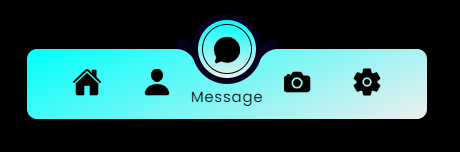
Layout and Design
The CSS is where the magic happens. It uses a combination of flexbox for layout, pseudo-elements for additional styling, and transitions for smooth animations. The navigation bar has a gradient background, giving it a modern look. Each menu item is carefully styled to create the circular icon effect and the revealing text animation.
The Glowing Indicator
The indicator is positioned absolutely and uses transforms for its movement, with a gradient background and border to create the glowing effect. One of the most interesting aspects of this project is the use of CSS transitions and transforms. These properties allow for smooth animations when switching between menu items, creating a polished and professional feel.
If Your Project is Not Working or Has Any Problem Don’t Worry, Just Click on Below Download Assets File And You Will Be Able To Get Full Control Of Our Projects , Then Customize And Use it For Your Coding Journey. Let the coding adventure begin!
By Downloading this assets You Will Be Able to create an Modern Toggle Navbar Using HTML & CSS Which Can Be Used For Several Projects i.e. A Flutter App Using Vs Code or For Android App Using Android Studio And Also For Custom Web Development.
Conclusion
Creating this Modern Navigation Menu is an excellent way to improve your front-end development skills. It combines HTML structure, CSS styling and animations, and JavaScript interactivity to create a cohesive and engaging user interface element. Whether you’re building a portfolio, a web app, or just practicing your skills, this project offers valuable experience in creating modern, interactive web components.
Remember, the key to mastering web development is practice and experimentation. Feel free to customize the colors, add more menu items, or even extend the functionality to create your own unique navigation menu. Happy coding!